
This article describes the “openpyxl” library, which manipulates Excel in Python.
Since Excel is equipped with many functions, it is not possible to provide a comprehensive explanation of all of them in a single article. The articles are divided by major themes(functions) and summarized as a series of articles [Python x Excel].
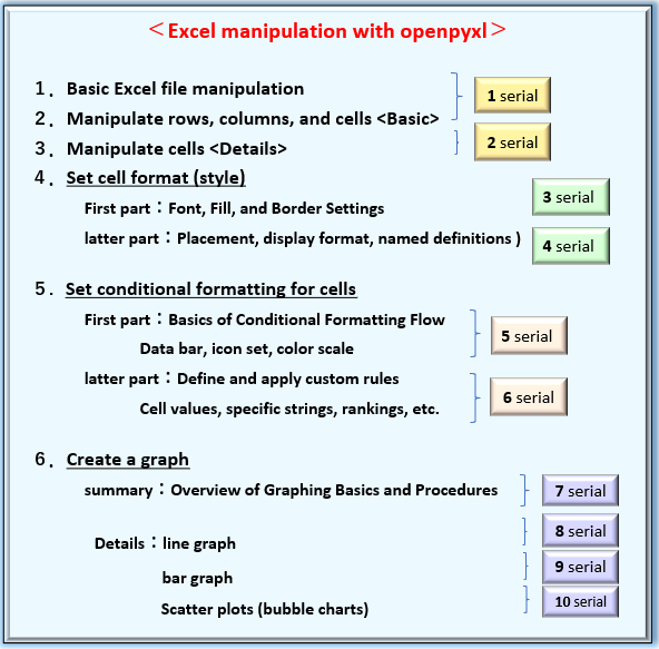
In the previous article (part 7 of the series), we introduced the “overview of the procedure for creating graphs” and the “classes and objects of the elements that make up a graph” using openpyxl.
From this time onward, we will explain more concretely the procedure of creating graphs with sample codes as “Practical Edition“. You will find that openpyxl makes it surprisingly easy to draw practical graphs.
Please stay with us until the end of this article, as you will be able to “do and understand” the following
Note that this is not an explanation of the graph itself, but rather the key points and special attributes (properties) when creating graphs in Python programs. Please refer to various specialized Excel books for explanations of graphs themselves.
The information presented on this site is only an example. Please refer to the official website for details and clarifications, if necessary.
【Official Site】:https://openpyxl.readthedocs.io/en/stable/
1. “Scatter Plot” Creation Procedure

This section explains the procedure for creating graphs (scatter and bubble charts) in oenpyxl. For graphs such as “Scatter” and “Bubble charts”, which allow different category (X-axis values) to be set for each series, it is not possible to batch reference multiple series at once.
Figure 2 shows the graphing procedure systematically.
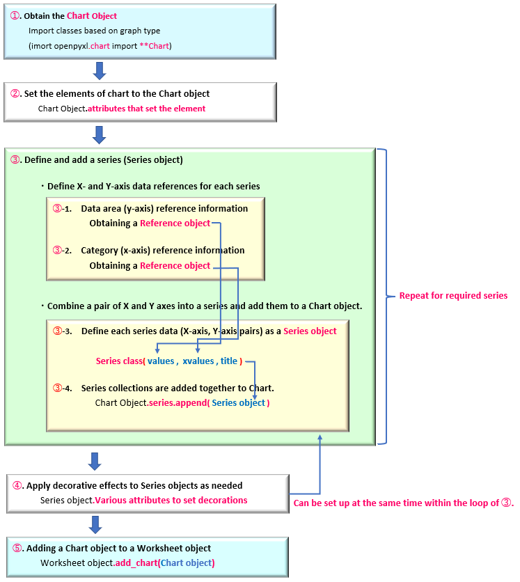
Supplement for each block.
(Note that ➀➁…etc. correspond to the numbers in Figure2. )
➀.【Create Chart Object】
For example, for a scatter chart, a dedicated class called “ScatterChart class” is provided. Import it and generate the object. This Chart object is the framework of the graph.
➁.【Set elements to Chart Object】
Graphs, not only scatter plots, are composed of (common) elements such as titles, legends, and axis titles. These are added and set to the Chart object with dedicated attributes (properties).
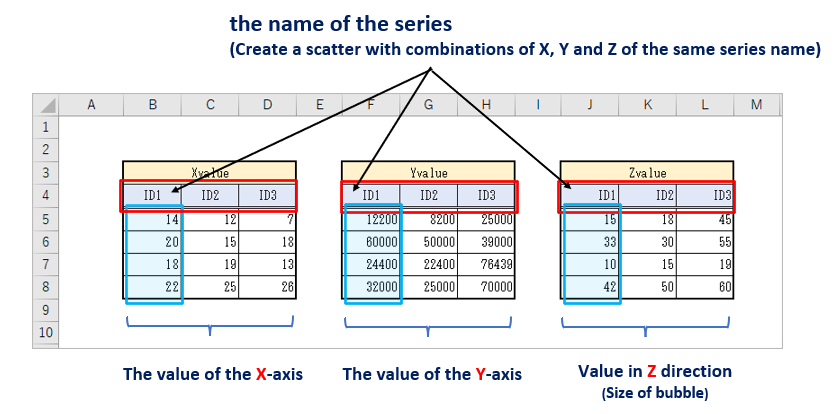
➂.【Define and Set (XY Axis) Reference data for each Series】
Since each series can have different items (X-axis), each series has one set of X-axis data and one set of Y-axis data. Therefore, reference information for each X/Y axis is defined as a Reference object. (Figure2 ➂-1, ➂-2)
The reference information for each X/Y is set as an argument of the Series class and organized as a Series object. (➂-3)
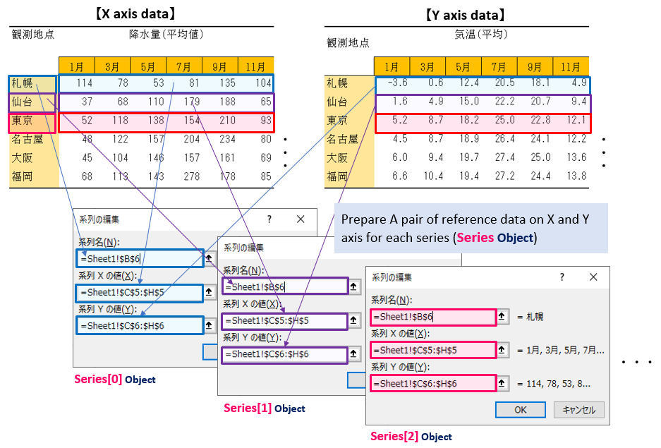
The following is an illustration of the “Series Object Definition”.
(Figure3 shows how a series is defined in the Excel “Edit Data”->”Edit Series” window.)
Then, the series data are added one by one to the framework(chart object) of the graph using the series.append() method of the Chart object. (➂-4)➂. must be repeated for each series. If there are multiple series, repeat the process with “For” or “While” statement.
The add_data() method to set all reference information at once is no longer needed.
If an object is obtained by specifying a series name as an argument of the Series class, the set_categories() method is also unnecessary.
➃.【Apply effects to each Series data】
If necessary, apply a fill, border, or other effect to the Series object added in step ➂. It may be set at the same time as the object definition in ➂.
➄.【Insert Graph into Worksheet】
Finally, insert the Chart objects defined in ➀~➃ into the worksheet using the add_chart() method of the Worksheet object.
The above is the procedure for creating a “scatter and bubble chart” graph. From the next section, we will provide detailed explanations with code examples.
2. Overview of “Scatter, Bubble” with openpyxl

“Scatter or Bubble Chart” is a convenient graph for expressing the distribution (variability) or transition of data paired on the X-axis (category) and Y-axis (value).
A similar type of chart is the “LineChart,” except that it does not require each series to share an X value(category).
Therefore, “scatter and bubble charts” must be defined as the Series object with reference information for each series, as shown in the procedure in Figure2.
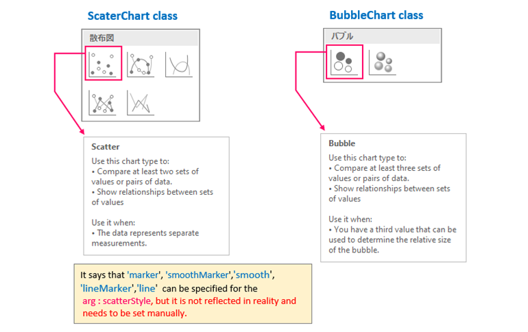
The ScatterChart class provides a class for scatter plots.
<Scatter>
from openpyxl.chart import ScatterChart
ScatterChart(scatterStyle)
arg: scatterStyle : Specify the form of the scatterplot (default:None) ※attention
option {‘smoothMarker’, ‘marker’, ‘lineMarker’, ‘smooth’, ‘line’}
return: Chart Object
※Many other optional arguments can be omitted
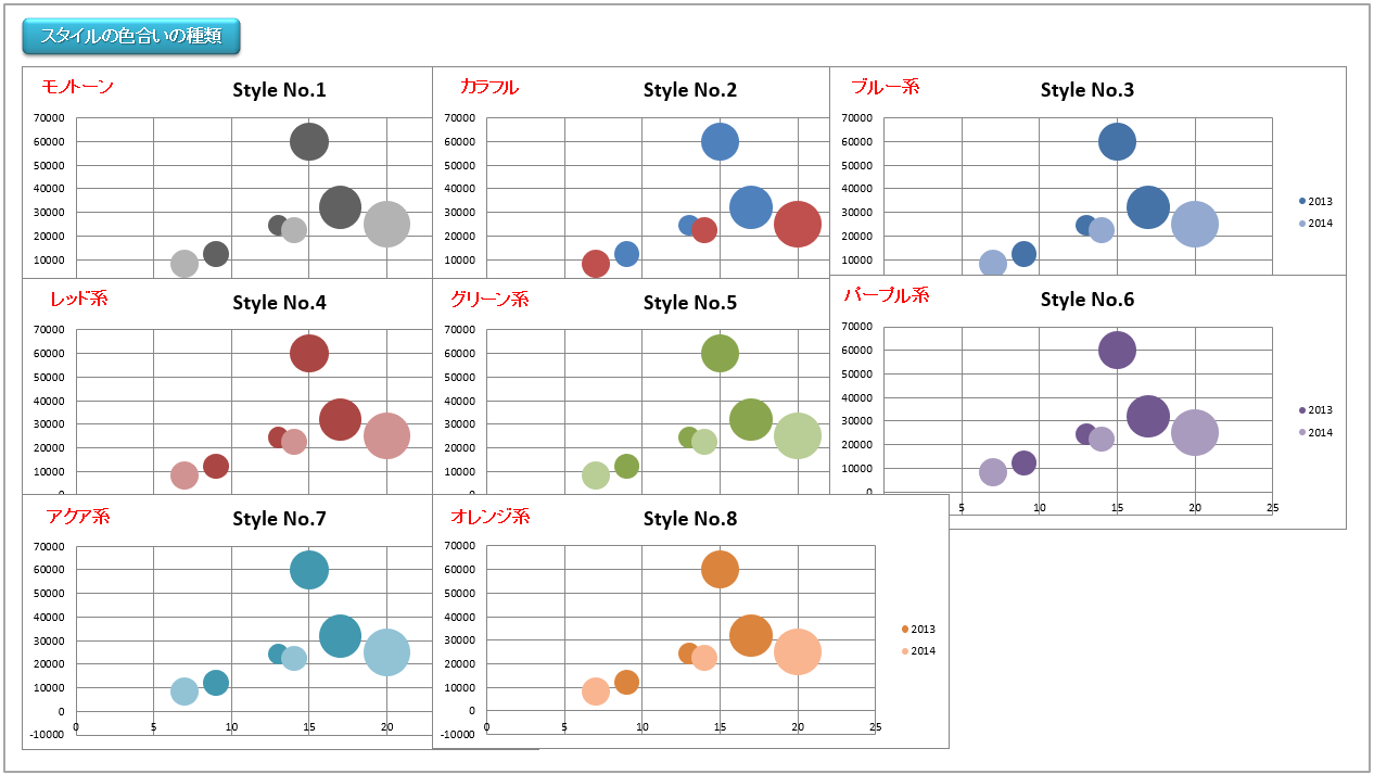
In Excel, there are five types of scatter plots to choose from, including plotted markers only, plotted lines, or both. (Figure4, left)
The above class specification says that they can be set by specifying options to the arg:scatterStyle, but according to the following note (quoted from the “official document”), even if these options are specified, it does not seem to work (for the moment).
Therefore, markers and lines are set individually for each series from the “Series object”.
The specification says that there are the following types of scatter charts: ‘line’, ‘lineMarker’, ‘marker’, ‘smooth’, ‘smoothMarker’.
However, at least in Microsoft Excel, this is just a shortcut for other settings that otherwise have no effect. For consistency with line charts, the style for each series should be set manually.
openpyxl official documentation <Comments on scatterStyle>
Next, the “Bubble Chart” will be explained.
openpyxl provides the BubbleChart class that provides a framework for bubble charting in the following format.
<Bubble Chart>
from openpyxl.chart import BubbleChart
BubbleChart(bubble3D, bubbleScale, showNegBubbles, sizeRepresents)
arg: bubble3D: Setting up 3D representation (default None) True(3D)/False(2D)
arg: bubbleScale: Set bubble size (デフォルトNone)
arg: showNegBubbles: Setting the Bubble Shadow Effect (default None) True(valid)/False(Invalid: default)
arg: sizeRepresents: Specify how bubble size is reflected (default None) {‘area’(Bubble area), ‘w’(width)}
return: Chart Object
※Many other optional arguments can be omitted
Bubble Chart is a graph that adds 3-dimensional elements in the Z-axis direction to the previous scatter plots, and draws bubbles according to the size of the data in the Z-direction.
Therefore, the BubbleChart class provides a number of arguments related to tertiary representations. Three of them are introduced here.
The arg:bubbleScale specifies the size of the bubble. Normally, in a bubble chart, the third arg:zvalues of the “Series class” specifies the size of the bubble diameter, but this argument “bubbleScale” allows you to specify the bubble scaling between 0% and 300% without changing the relative ratio of the diameters.
The arg:sizeRepresents allows you to choose how the bubble diameter size is reflected in the ‘area‘ or ‘w‘ (width). If omitted, it is expressed as “area”.
There is also one cautionary point.
BubbleChart class has the arg:bubble3D. The official document indicates that the Bool type (“True”/”False”) can be used for 3D representation, but when I actually set it, an error message was displayed and it could not be reflected. (The error occurs at least in the Excel environment. The default setting of “None” (2D representation) does not generate this error).
To create a three-dimensional representation of a bubble chart, you can use the “Series class (object)” argument or attribute (bubble3D) to set each series. This is shown in the sample code below.
This is an overview of scatter plots and bubble charts. The next section will explain the procedure with sample code.
3. Implement “Scatter Plot”

Now, we will explain an example of implementation of a “scatter chart” with the following specifications, step by step, in order.
The table that will be the source data will also be as follows.
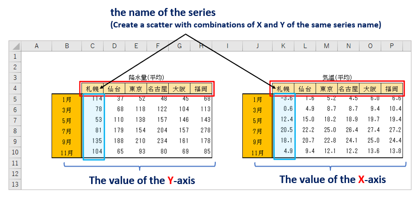
Create a scatter plot where each “city name” is a series, the category(X-axis) is “temperature” (table on the left), and the data (Y-axis) is “precipitation” (table on the right).
3.1 Define Outline of “Scatter Plot”【Step.1】
First, import the necessary classes, then define the ScatterChart object that will be the framework of the graph, and the elements that make up the graph area, such as the title and legend, in the following <List1>.
The file (.xlsx) used in this sample can be downloaded from.
# Import of module and class -------------------------------------------
from openpyxl import load_workbook
# Classes required for scatter plots
from openpyxl.chart import ScatterChart, Reference, Series
# Classes required for pattern-fill
from openpyxl.drawing.fill import PatternFillProperties, ColorChoice
# Classes required to define data label
from openpyxl.chart.label import DataLabel, DataLabelList
# Read file (sheet) --------------------------------------------------------
wb = load_workbook('Graph_DataSource.xlsx') # Reading Excel files
ws = wb.worksheets[0] # Obtaining a Worksheet object
# [A] Preparation of graph and components ---------------------------------------
# Obtain a Chart object (Scatter)
c1 = ScatterChart()
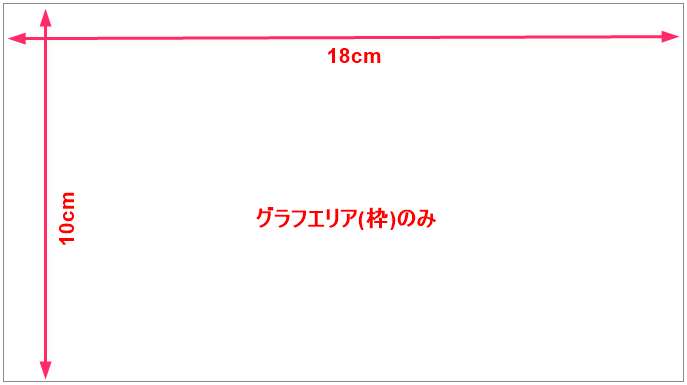
# Adjust graph size
c1.width = 18 # default(15cm)
c1.height = 10 # default(7cm)
# Set titles for graphs (main, axis)
c1.title = "Scatter Chart" # main title
c1.x_axis.title = 'Temperature' # X-axis title
c1.y_axis.title = 'Precipitation' # Y-axis title
# Graph legend
c1.legend.position = 'b' # Location of legend
#---------------------------------------------
# Continue to <List2>Now, let me explain the key points.
The ScatterChart class and a set of classes necessary for formatting each series of data are imported.
A Chart object, which is the framework of the scatter chart, is obtained by the constructor from the ScatterChart class. From this point on, the methods and attributes (properties) under the Chart object are used to specify the size of the chart, set the main and subtitle, and set the legend and its placement.
See also for details <Line chart・Bar chart>.
If you execute only <List1>, you will see nothing but the frame of the graph area as shown in Figure5, but once you define the plot area in the next <List2>, the axes and legend will be reflected.
3.2 Define Reference Data for Series【Step.2】
Add <List2> following <List1>. In <List2>, we will define the data reference information in the “Chart object” for each series.
# [B] Set series data in a Chart object ------------------------------------------------
# Obtain reference information for each series
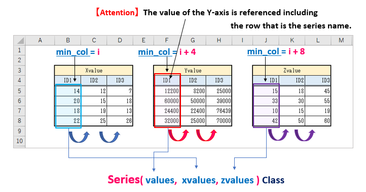
for i in range(3, 9):
# Refer to the Y-axis value of the series(including the line that is the name of the series.)
# Column "i", Rows 4-10
values = Reference(ws, min_col=i, max_col=i, min_row=4, max_row=10)
# Refer to the X-axis value of the series
# Columns "i "+8, Rows 5-10
xvalues = Reference(ws, min_col=i+8, max_col=i+8, min_row=5, max_row=10)
# Define the Series object
series = Series(values, xvalues, title_from_data=True)
# Adding individual Series objects to a Series collection
c1.series.append(series)
#---------------------------------------------
# Continue to <List3>Since a Series object must be defined for each series, the For statement is repeated for the number of series. In this case, we define a series where the table on the left side of Figure 6 is the value of Y and the table on the right side is the value of X.

Define a “Reference object” that refers to the Y-axis value of the series. This time, we will reference the range of cells in rows 4-10 of column “i”, including the row number that will become the series name.
A “Reference object” that refers to the X-axis values of the series is also defined in the same way. It is important to note that we do not include here the line numbers that we want to be the series names. Thus, it refers to the range of cells in rows 5~10 of column “i+8”.
Define a “Series object” by grouping the previous X and Y Reference objects together.
By specifying “True” for the arg:title_from_data, “C4:H4” (the element in the first line of the range (*)) can be set as the series name.
※ The series name can be specified with the arg:titles_form_data only for the element on the first line. Since it cannot be specified in the column direction, the table must be arranged as shown in Figure6.
The series attribute of the Chart object is used to get the Series collection, and the append() method is used to add the series one by one to the collection.
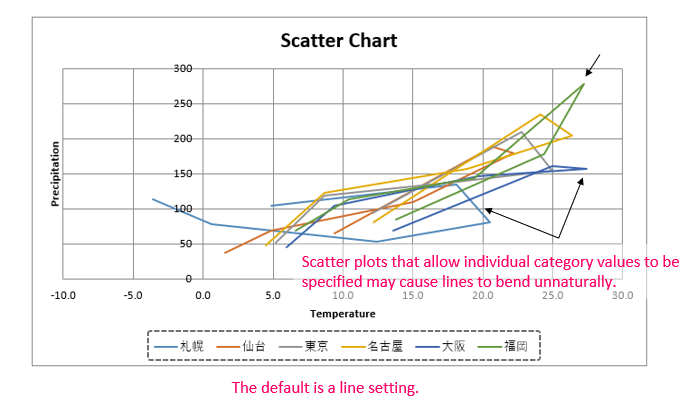
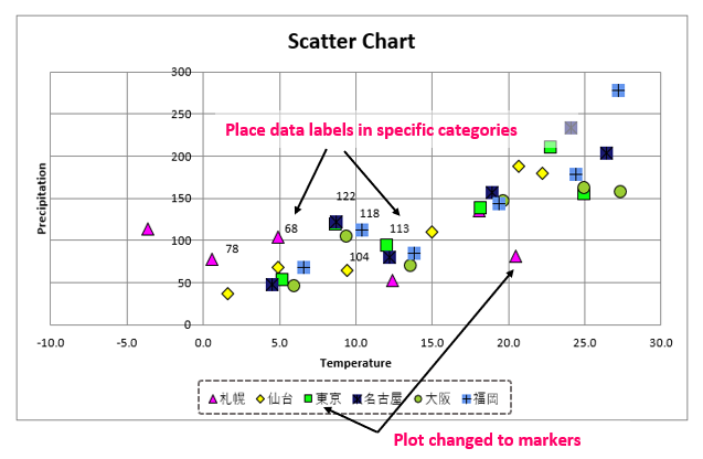
The result of executing the code up to this point is shown in Figure7. By default, the plots are connected by lines. Since scatter plots are often used to understand the scatter distribution of plots, it is sometimes better to use markers to highlight the plots than to tie them together with lines. This is another case where the line is not needed because it will be difficult to see.
3.3 Format the Series【Step.3】
Add <List3> following <List2>. In <List3>, the form of the series, decorations, and other aspects of its appearance will be arranged.
# [C] Set markers for each series -----------------------------

# Dictionary format for specifying the symbols of the markers that represent the plots of each series
marker_symbol = {1:"triangle", 2:"diamond", 3:"square", 4:"star", 5:"circle", 6:"plus"}

# Prepare colors to fill in markers in dictionary format as well
# Color is specified by two types: RGB Hex specification and ColorChoice object specification.
marker_solidFill = {1:"FF00FF", 2:"FFFF00", 3:"FFF0F",
                        4:ColorChoice(prstClr="midnightBlue"),
                        5:ColorChoice(prstClr="yellowGreen"),
                        6:ColorChoice(prstClr="cornflowerBlue")}


# Define data labels (apply labels only to the second category in the whole series)
lb = DataLabel(idx=1, showVal=True)
lbl = DataLabelList(dLbl=[lb])


# Sets attributes on individual Series objects.
# enumerate expands object and index at the same time
for i, obj in enumerate(c1.series, 1):

    # Disable the line
    obj.graphicalProperties.line.noFill = True
    # Setting of markers below
    obj.marker.symbol = marker_symbol[i] # Specify symbols
    obj.marker.size = 10                 # Specify size
    obj.marker.graphicalProperties.solidFill = marker_solidFill[i]  # fill color
    obj.marker.graphicalProperties.line.solidFill = "000000"        # Set border to black
    # Set data labels
    obj.labels=lbl


# Add Chart object to worksheet and save -----------------------------------------

ws.add_chart(c1, "B13")      # Paste the graph in cell B13 in the upper left corner
wb.save('Scatter_example1_with_label.xlsx')
As shown in Figure7 above, for this data distribution, it seems more convenient to highlight each plot with a marker than to connect the plots with a line. Therefore, in <List3>, we will disable lines and set markers using the attributes under the “Series object” of each series.
Marker symbols and fill colors are predefined in dictionary form. (The key is set to the index to be referenced later.) The default options that can be specified for the symbol are {‘plus‘, ‘diamond‘, ‘square‘, ‘dash‘, ‘circle‘, ‘x‘, ‘auto‘, ‘circle‘, ‘star‘, ‘picture‘, ‘triangle ‘}.
In addition, there are two ways to specify colors: one is to use “RGB hex notation (string)” and the other is to use “ColorChoice object”. The format of the ColorChoice class is as follows
from openpyxl.drawing.fill import ColorChoice
ColorChoice(prstClr, srgbClor, sysClor, schemeClor)
arg: prstClor: Specify from built-in color options
(‘cornflowerBlue’, ‘darkCyan’, ‘darkSlateGrey’, ‘darkSlateBlue’, and many more)
arg: srgbClor: Specified by RGB string (‘FFFFFFFF’)
arg: sysClor: Specify by SystemColor Object
arg: schemeClor: Specify by SchemeColor Object
return: ColorChoice Object
Only the second item (category) in the series will have the data label applied. Data labels are defined by “Datalabel objects” obtained from the Datalabel class in the following format.
The arg:idx is set to “1” to indicate the second element. Then, the data labels are grouped into collections in the DatalabelList class.
from openpyxl.chart.label import DataLabel
DataLabel(idx, showVal, showSerName, showPercent)
arg: idx: Specify the category index
arg: showVal: Display numerical values on labels True(valid)/False(Invalid・default)
arg: showSerName: Display series name on label True(valid)/False(Invalid・default)
arg: showPercent: Display the percentage (%) on the label True(valid)/False(Invalid・default)
return: DataLabel Object
from openpyxl.chart.label import DataLabelList
DataLabelList(dLbl, showVal)
arg: dLbl: Specify DataLabel objects in list format (for the required elements)
arg: showVal: Specify True if the label is to be set
(However, if True is specified, all categories are displayed at once. To specify individual categories, do not specify or set to False (default).)
return: DataLabelList Object
From line 21, the “For” statement and the enumerate function are used to expand the collection to “Series object” and “Index (beginning with 1)”. These are set by each attribute.
To change from the default line style (Fig.7) to the marker style, the nofill attribute of the Line object is set to “True” to disable the line.
For more information on the Line object, see <here>.
Each attribute of the Marker object applies a format to the marker. Symbols and colors take values from the dictionary defined in lines 4 and 8, using the index as keys. Then, they are set to each series. Size (10) and border (black “000000”) are fixed values.
For more information on Marker objects, please refer to <here>.
Finally, after setting the “DatalabelList object” in the labels attribute, paste the Chart object into the worksheet and save the book.
This is the end of the explanation of the sample code. The result of concatenating and executing all <List1> ~ <List3> is shown in Figure 8.
The plot is now marked with a marker, and the shape and color of the symbol has changed. Then a data label is added for the second item. This is easier to understand compared to Figure7.
The results of Sample can also be downloaded below.
4. Implement “Bubble Chart”

Next, we will introduce an example of Bubble Chart implementation. We will explain step by step about a bubble chart with the following specifications.
The original data is also shown below.
Let “ID1…” be the name of the series, the categories(X-axis) refer to (left table), the data (Y-axis) refer to (center table), and the plot size (Z-axis) refers to (right table).
4.1 Define Outline of “Bubble Chart”【Step.1】
First, import the necessary classes, then define the “BubbleChart object” that will be the framework of the chart, and the elements that make up the chart area, such as the title and legend, in the following .
The file (.xlsx) used in this sample can be downloaded from.
# Import of module and class -------------------------------------------

from openpyxl import Workbook

# Classes required for bubble chart
from openpyxl.chart import BubbleChart, Series, Reference

# Class➀ required for gradient fill.
from openpyxl.drawing.fill import GradientFillProperties, GradientStop

# Class➁ required for gradient fill.
from openpyxl.drawing.fill import ColorChoice, LinearShadeProperties

# Load source file (sheet) ------------------------------------------------------
wb = load_workbook('Graph_DataSource_Bubble.xlsx')  # Reading Excel files
ws = wb.worksheets[0]                               # Obtaining a Worksheet object


# [A] Graph Body and Outline Settings -------------------------------------------

# Obtaining a Chart object
c1 = BubbleChart()

# Adjust graph size
c1.width = 18     # Default (15cm)
c1.height = 10    # Default (7cm)

# Chart Legend
c1.legend.position = 'b'   # Legend Location

# Style setting
c1.style = 18

#---------------------------------------------
# Continue to <List2>Line 6 imports the “BubleChart class” and the “Reference class” that defines reference information. It also imports a set of classes necessary to apply the formatting (bubble fill effect) for each series.
A “Chart object,” which is the framework of the chart, is obtained by constructor from the BubbleChart class. From now on, we will use the methods and attributes (properties) under this Chart object to configure the details of the chart.
The same for all types of graphs. Please refer to <Line・BarChart> for details.
Incidentally, you can easily set the default style (color tone, shadow, 3D effect, etc.) by using the style attribute on line 32. Examples of style settings will be presented later in this section.
4.2 Define Reference Data “Bubble Chart”【Step.2】
Add <List2> following <List1>. <List2> defines reference information for each series of data.
# [B] Set series in a Chart object -----------------------------------------------

# Obtain reference information for each series
for i in range(2, 5):

    # Column "i", rows 5-8
    xvalues = Reference(ws, min_col=i, max_col=i, min_row=5, max_row=8)      # X-axis data
    # Column "i+4", rows 4-8
    yvalues = Reference(ws, min_col=i+4, max_col=i+4, min_row=4, max_row=8)  # Y-axis data
    # Column "i+8", rows 4-8
    zvalues = Reference(ws, min_col=i+8, max_col=i+8, min_row=5, max_row=8)  # Bubble size

    # Define individual series data as Series objects (3D)
    series = Series(values=yvalues, xvalues=xvalues, zvalues=zvalues, title_from_data=True)

    # Adding series data to the Series collection
    c1.series.append(series)

#---------------------------------------------
# Continue to <List3>
Since a Series object must be defined for each series, the “For statement” is repeated for the number of series. This time we will define three series, so we will process the following three times.
Next, a “Series object” is defined to manage the series information. The difference from the previous is that the third-order reference information (Reference object specifying the bubble size) (line 11) must be set to the arg:zavlues of the Series class. (Figure9)
The series attribute is used to obtain the Series collection, and the append() method is used to add the series.
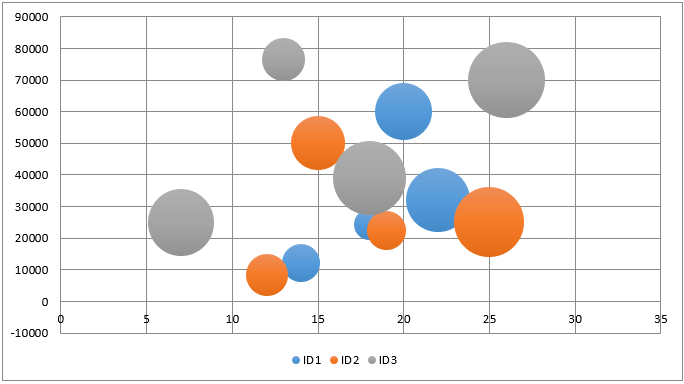
Fig10 shows the results up to <List2>. A beautiful bubble chart could be drawn using only the style attribute specified in the previous <List1>.
As a supplement to the style attribute, here is an example of applying the style.
The “tint” of the bubble can be selected from the following eight types (Fig11)
For “other effects,” you can also choose from the following six types (Fig12)
Of course, you can also define and apply your own style in addition to using the style attribute. In the next <sec 4.3>, we will show an example of formatting by series.
4.3 Set “Fill-Format” of the Series【Step.3】
Add <List3> following <List2>. In <List3>, the series is formatted. Here is an example of applying a “3D effect” or “Fill (Gradient)” to a bubble.
# [C] Set up by series ------------------------------------------------

# Settings for Series2
ser2 = c1.series[1]
ser2.bubble3D = True # Make it a 3D expression


# Settings for Series3
ser3 = c1.series[2]
ser3.bubble3D = True

# Apply gradient effects

# Define color specifications and thresholds as GradientStop objects
gs1 = GradientStop(pos=20000, prstClr="medVioletRed")
gs2 = GradientStop(pos=60000, prstClr="aquamarine")
gs3 = GradientStop(pos=90000, prstClr="cornflowerBlue")

# Define gradient effects as GradientFillProperties objects
gfProp = GradientFillProperties()           # Get an Object
gfProp.stop_list = [gs1, gs2, gs3]          # Pass color gradation definition in the stop_list attribute
gfProp.linear = LinearShadeProperties(90)   # Linearly varying gradient

# You can also pass class arguments directly as follows
#gfProperty = GradientFillProperties(gsLst=[gs1, gs2, gs3], lin=LinearShadeProperties(90))

# Set GradientFillProperties object with gradFill attribute (apply gradient)
series.graphicalProperties.gradFill = gfProp


# Add Chart object to sheet and save -----------------------------------------

ws.add_chart(c1, "D12")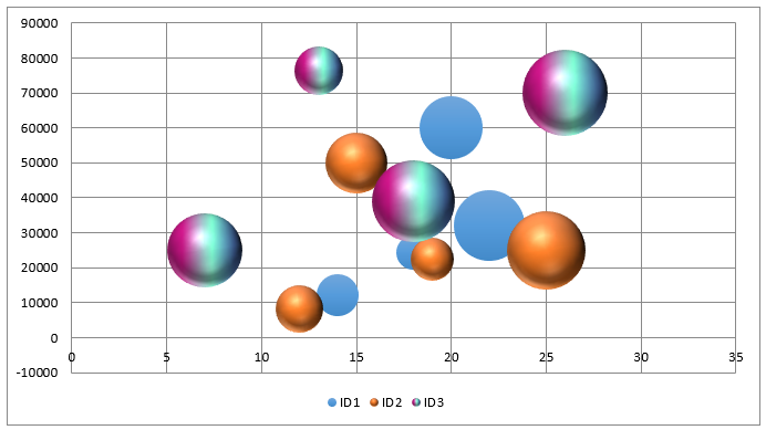
wb.save("Bubble_Sample.xlsx")Change the bubble from a 2D to a three-dimensional (3D) effect.
The objects of series 2 and 3 are obtained by specifying the indices “1” and “2” in the Series collection. In the explanation of the <BubbleChart Class> specification at the beginning of this article, it was explained that the arg:bubble3D cannot be used to 3D express. However, actually, the Series object also has the arg: bubble3D, which can be set to “True” to achieve a three-dimensional (3D) representation.
In other words, within the same plot area, both 3D and 2D bubbles can be specified for each series, and they can coexist.
Apply a fill (gradient) to the bubble. In this case, we will apply a three-color linear gradient to series3.
First, define a GradientStop object that will serve as the gradation information (color and threshold) as shown in lines 15 to 17.
Next, the GradientFillProperties object is obtained, which is the framework of the gradient definition. The stop_list attribute under the object specifies the tonal information in a list format, and the linear attribute specifies the linearity of the tonal change. It can also be specified directly in the class argument, as shown in the comment on line 25.
See below for the format of the “GradientStop” and “GradientFillProperties class”.
from openpyxl.drawing.fill import GradientStop
GradientStop(pos, scrgbClr, schemeClr, prstClr)
arg: pos: Specify color switching threshold
arg: scrgbClr: Specify color in RGB (6-digit Hex string)
arg: schemeClr: Specify color by theme color (SchemeColor object)
arg: prstClr: Specify with default color
(Choose from a large number of options such as ‘cornflowerBlue’, ‘darkCyan’, ‘darkSlateGrey’, …)
return: Chart Object
※ Many other optional arguments that can be omitted
from openpyxl.drawing.fill import GradientFillProperties
GradientFillProperties(gsLst, lin, path, tileRect)
arg: gsLst: Specify gradient color and threshold (position)
(Set up a GradientStop Object in list format)
arg: lin: ”Linear” for gradient direction
(Set up a LinearShadeProperties Object )
arg: path: ”Path” for gradient direction
(Set up a PathShadeProperties Object)
arg: tileRect: ”square” for gradient direction
(Set up a RelativeRect Object)
return: Chart Object
※ Many other optional arguments that can be omitted
And finally, on line 28, the gradFill attribute is used to apply the defined gradient information.
This is the end of the explanation of the sample code. The result of concatenating <List1>~<List3> and executing it is shown in Fig13. Bubbles of series 2 and 3 are three-dimensional and gradation is applied.
The results of Sample can also be downloaded below.
5. Summary

How was it?
Introduced the procedures for creating scatter and bubble charts using “openpyxl” with actual examples.
While some points may have been difficult to understand from the previous explanation of classes and objects, we hope that you felt that your understanding was deepened by reading the actual code.
Also, since there are some patterns in the code for creating graphs, please try to arrange them with reference to the sample code introduced here.
Let’s summarize what we have so far.
➀. Such as a scatter or bubble chart allows different items (categories) to be set for each series define a Series object for each series and add it to the Chart object.
・Scatter plots get Chart object from “ScatterChart Class”
・Bubble chart gets Chart object from “BubbleChart Class”
➁. Scatter plots must be set manually for each series “Series object” because the class arg:scatterStyle does not allow for graph form.
➂. When applying a 3D effect to a bubble chart, it cannot be reflected by the class arg:bubble3D. Therefore, use the argument of the same name of the “Series object” to set the effect.
There are many other types of graphs in Excel.
Examples include the widely used “Line graph” and “Bar graph”. Please also refer to the following related articles.
I hope to introduce you to the other types at another time, so stay tuned!
Thank you for your patience to the end.