This article describes the “openpyxl” library, which manipulates Excel in Python.
Since Excel is equipped with many functions, it is not possible to provide a comprehensive explanation of all of them in a single article. The articles are divided by major themes(functions) and summarized as a series of articles [Python x Excel].
In the previous article (part7 of the series), we introduced the “overview of the procedure for creating graphs” and “classes and objects of the elements that make up a graph” using openpyxl.
From this time onward, we will explain more concretely the procedure for creating graphs with sample codes as a [Practical Edition].
By following the actual code, you will be able to better understand the “sequence of steps in creating a graph,” “hierarchical composition of objects that compose a graph,” and “various attributes,” which were explained in the previous [Overview Edition]. You will find that openpyxl makes it easy to draw practical graphs.
Please stay with us until the end of this article, as you will be able to “do and understand” the following.
Note that this is not an explanation of the graph itself, but rather the key points and special attributes (properties) when creating graphs in Python programs. Please refer to various specialized Excel books for explanations of graphs themselves.
The information presented on this site is only an example. Please refer to the official website for details and clarifications, if necessary.
【Official Site】:https://openpyxl.readthedocs.io/en/stable/
1. “Line Chart” Creation Procedure

This section describes the procedure (flow) for creating graphs in oenpyxl.
For line, bar, and other types of graphs that share the same item (X-axis value) for each series, all series data can be referenced together as the Reference object. The entire flow is systematized in Figure2.
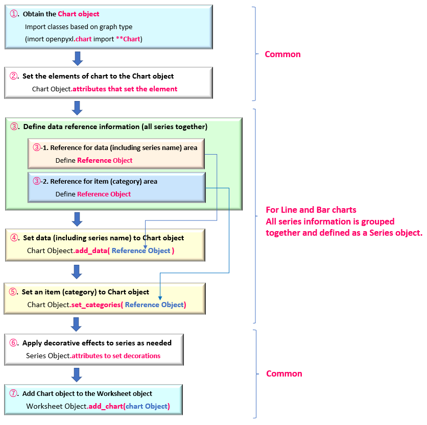
This section describes the blocks (➀~➆) in Figure2.
➀.【Get Chart Object】
The Chart object is the framework of the graph.
A dedicated class is provided for each type of graph. In the case of this “Line Chart”. The LineChart object is obtained from the LineChart class.
➁.【Add Graph Element to Chart Object】
The elements that make up a graph include the title, legend, and axis titles etc… .
These are added and set by the attributes (properties) under the Chart object.
➂.【Define Reference Data as Reference Object】
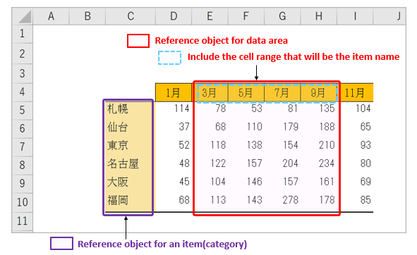
Define the cell range referenced by the graph as the Reference object. There are two cell ranges to be referenced: “data area including series name” and “item name“. (Figure3)
For Reference class, see <Related Article>.
➃.【Set data in the Chart Object】
Add the Reference object that points to the data area defined in ➂ to the Chart object with the add_data() method.
➄.【Set Item name (Category) to Chart Object】
Add the Reference object defined in ➂ to the Chart object using the set_categories() method.
➅.【Apply Effects to each Series data】
Individual series data in a graph are managed as Series objects. Decorative effects in the plot area, such as markers, lines, and fills, are set in the attributes under the Series object.
A Series object can be obtained with the series property of a Chart object.
➆.【Insert Graph into Worksheet】
Finally, in the argument of the add_chart() method of the Worksheet object, specify the Chart object and the insertion position (cell address) of the graph you have defined so far, and insert it into the worksheet.
These are the steps for creating a graph.
From the next section, we will provide detailed explanations with specific sample code. This time, we will introduce an example of a “Line Chart“.
2. Overview of “Line Chart” with openpyxl

“A line graph” is the most common type of graph, in which the X-axis (item names) and Y-axis (values) are plotted as a pair, and each plot is connected by a line.
Data reference information is managed by grouping all series data together as the “Reference Object”.
A similar graph is a “scatter plot,” but the difference is that the values (categories) on the X-axis are shared among the different series.
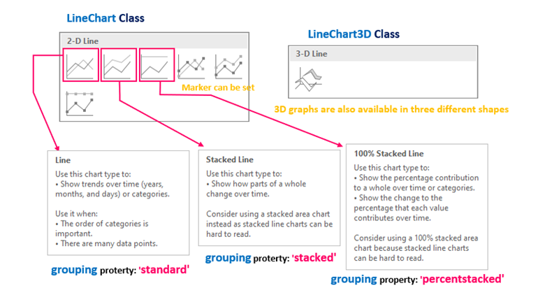
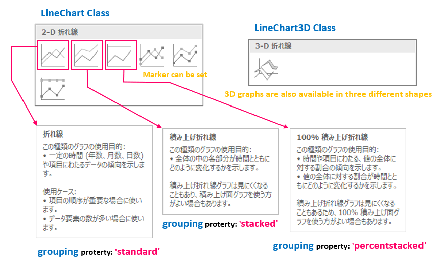
There are two classes that provide the Framework of a line chart (Chart object): the LineChart class for planar (2D) charts and the LineChart3D class for three-dimensional (3D) charts, depending on the number of dimensions of the representation.
<Line Chart>
from openpyxl.chart import LineChart
LineChart(marker, smooth)
arg: marker : Set with or without marker(default:None) True:marker enabled/False:Marker disabled
arg: smooth : Setting Smooth Lines (default:None) True:enable/False:Disable
Many other optional arguments
return: LineChart Object
<Line (3D) Chart>
from openpyxl.chart import LineChart3D
LineChart3D(gapDepth, marker, smooth)
arg: gapDepth : Adjust the depth of the floor(default:None)
arg: marker : Set with or without marker(default:None) True:marker enabled / False:Marker disabled
arg: smooth : Setting Smooth Lines (default:None) True:enable / False:Disable
Many other optional arguments
return: LineChart3D Object
The grouping attribute of the LineChart object allows you to select a line chart format from “standard“, “stacked” and “percentstacked“. The number of dimensions of the representation and the characteristics of each form are shown in Figure4.
The components of a plot area include markers (Marker objects) and lines (Line objects) and each series is managed by a Series object.
The above is an overview of line charts (LineChart objects). From the next section, I would like to explain the creation procedure step by step, showing concrete sample code.
3. Implement “Line Chart (2D)”

Now, we will explain a step-by-step implementation example of a line chart with the following “specification”.
3.1 Define Outline of “Line Chart”【Step.1】
From the import of the class to be used, define the LineChart object that will be the framework of the chart, and the elements that make up the chart area, such as the title and legend, in the following .
The file (.xlsx) used in this sample can be downloaded from.
from openpyxl import load_workbook

# Import classes needed for graphing
from openpyxl.chart import LineChart, Reference, Series
from openpyxl.utils.units import pixels_to_EMU


wb = load_workbook('Graph_DataSource.xlsx') # Reading Excel files (data)
ws = wb.worksheets[0]    # Worksheet Object

# [A] Preparation of graph components ------------------------------------------

 c1 = LineChart()   # Get Chartobject (Framework of line chart)

# Adjust graph size
c1.width = 18     # default(15cm)
c1.height = 10    # default(7cm)


# Set titles for graphs (main, axis)
c1.title = "Line Chart"              # main title
c1.x_axis.title = 'Month'            # X-axis title
c1.y_axis.title = 'Precipitation'    # Y-axis title

# Graph legend
c1.legend.position = 'b'     # Location of legend

# Graph Style
c1.style = 30               # Setting the theme color
c1.grouping = "standard"     # Line chart type (standard)

# Continue to <List2>
In line 13, the LineChart object is obtained from the LineChart class (stored in variable c1). In subsequent processes, the methods and attributes (properties) under the “LineChart object” are used to construct the graph.
The default size of the graph is (17cm x 7cm), but if you want to specify the size individually, use the width/height property.
The main title is set in the title property, and the X/Y axis subtitle is set in the title property for each axis object. The axis object is obtained via the x_axis/y_axis property, but in this code example, the attribute-chain(surper_attribute. sub_attribute) at a time.
The legend object is obtained with the legend property. By default, the legend is automatically displayed, but it can be hidden by setting the “legend attribute” to “None“.
The placement of the legend can also be specified with the position property. In this example, we specify ‘b‘ and set it to be placed at the bottom of the plot area. There are also ‘r‘, ‘l‘, ‘t‘, and ‘tr‘ for placement position.
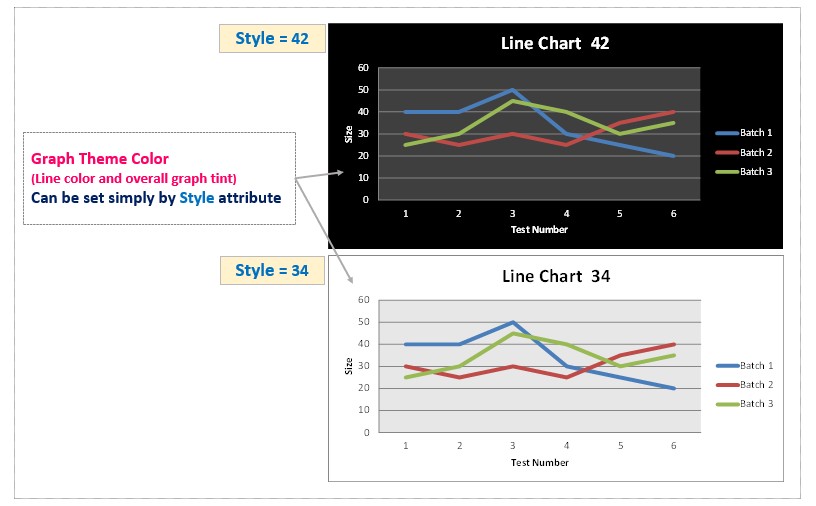
The theme color of the entire graph can be easily changed by setting the specified index in the style attribute. (Figure5) Graph styles are also explained later in <section5.2>.
3.2 Define Reference Data for “Line Chart”【Step.2】
Add <List2> following <List1>. <List2> adds data reference information to the LineChart object.
# [B] Obtain data reference information ----------------------------------------------
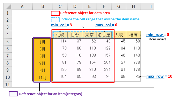
# Obtain the reference object for the cell range (including the series name)
# Refer to columns 3(C)-6(F), rows 4-10
data = Reference(ws, min_col=3, max_col=6, min_row=4, max_row=10)
# Obtain a reference object for the category
# Refer to column 2(B), rows 5-10
category = Reference(ws, min_col=2, max_col=2, min_row=5, max_row=10)
# Set Reference Object to Chart object
c1.add_data(data, titles_from_data=True) # Specify True for the second argument to make the first element the series name.
c1.set_categories(category) # Set item (category)First, line 5 defines data reference information as the Reference object. (red frame line in Fig6) In this case, specify the range including the cell range of the series name (blue dashed line in Fig6).
Next, in line 9, the “Reference object” of the reference information, which is the item name (category), is defined in the same way. (in the purple box in Fig6)
Then, set the data information to the “LineChart object” using the add_data() method in line 12 and the item (category) information using the set_categories() method in line 13, respectively.
In the add_data() method, set the arg:title_from_data to “True” to identify the first element of the data area as the series name.
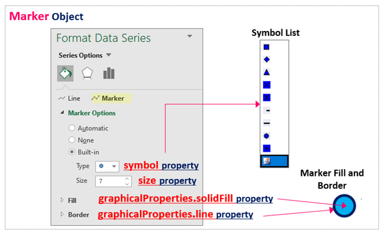
3.3 Set Series Format(Marker)【Step.3】
Add <List3> following <List2>. <List3>will be a block that applies marker formatting to the four series.
The series data are grouped together as the Series collection. Therefore, to format individual series data, you must extract elements (Series object) from the collection one by one.
# [C] Set markers and lines for each series

# <Series1> -----------------------------------------------------------
ser1=c1.series[0]

## Marker setting
ser1.marker.symbol = 'circle'     # Specify marker shape (circle)
ser1.marker.size = 8              # Set marker size (integer)
ser1.marker.graphicalProperties.solidFill = 'FF0000'       # Set marker fill color
ser1.marker.graphicalProperties.line.solidFill = '0F0F0F'  # Set marker border color


#  <Series2> -----------------------------------------------------------
ser2=c1.series[1]

## Marker setting
ser2.marker.symbol = 'diamond'    # Specify marker shape (diamond)
ser2.marker.size = 9              # Set marker size (integer)
ser2.marker.graphicalProperties.solidFill = '0202F2'       # Set marker fill color
ser2.marker.graphicalProperties.line.solidFill = '00F0F'   # Set marker border color


# <Series3> -----------------------------------------------------------
ser3=c1.series[2]

## Marker Setting
ser3.marker.symbol = 'triangle'   # Specify marker shape (triangle)
ser3.marker.size = 9              # Set marker size (integer)
ser3.marker.graphicalProperties.solidFill = '00FF11'       # Set marker fill color
ser3.marker.graphicalProperties.line.solidFill = '00F0F'   # Set marker border color


#  <Series4> -----------------------------------------------------------
ser4=c1.series[3]                 # Disable the marker
The series property is used to obtain all the series in the plot area (Series collection). Individual elements can be accessed in collections by index. In this example, “0” is specified to obtain the “Series object” that will become <Series1>. The same for other <Series2,3,4>
Settings related to <Series1> markers. Markers can be obtained as objects with the marker property. Thereafter, detailed settings will be made by connecting attributes under the “Marker object” (attribute-chain). The same for other <Series2,3,4>
The shape of the marker is connected to the symbol property, the size property to the size, and the fill and border property are further connected via the graphicalProperties property.
In <Table1> below, the attributes under the “Marker object” are organized.
| 【Property Name】 | 【Functions】 | 【Others/Details】 |
|---|---|---|
| symbol Property | Set the shape of the marker | ’triangle’ ,‘plus’, ‘diamond’… etc |
| size Property | Set marker size | floating point such as 7.0 |
| graphicalProperties.solidFill Property | Marker Fill-in | In addition to RGB notation (‘FF0000’…. . etc.), can be set by ColorChoice object |
| graphicalProperties.line.solidFill Property | Marker border color | In addition to RGB notation (‘FF0000’…. . etc.), can be set by ColorChoice object |
The shape of the marker specified in the symbol property can be selected from {‘plus’, ‘diamond’, ‘square’, ‘dash’, ‘dot’, ‘x’, ‘auto’, ‘circle’, ‘star’, ‘picture’, ‘triangle’}.
The correspondence between the Excel marker setting window and each attribute is shown in Fig7.
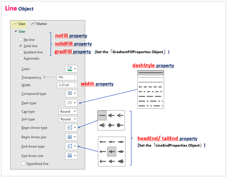
3.4 Set Series Format(Line)【Step.4】
Add the following <List4> after <List3>. <List4> will be a block that will apply the “line type and color” formatting to the four series.
# [D] Set up a line for each series

# <Series1> -----------------------------------------------------------
ser1=c1.series[0]

# Line setting
ser1.graphicalProperties.line.solidFill = '00AAAA'         # Set line color
ser1.graphicalProperties.line.dashStyle = "dashDot"        # Set the line type
ser1.graphicalProperties.line.width = pixels_to_EMU(2.5)   # Set line thickness Specify with EMUs


# <Series2> -----------------------------------------------------------
ser2=c1.series[1]

# Line setting
ser2.graphicalProperties.line.solidFill = 'AAAA00'         # Set line color
ser2.graphicalProperties.line.dashStyle = "sysDashDot"     # Set the line type
ser2.graphicalProperties.line.width = pixels_to_EMU(2.5)   # Set line thickness Specify with EMUs


# <Series3> -----------------------------------------------------------
ser3=c1.series[2]

## Line Setting
ser3.graphicalProperties.line.noFill=True     # Disable the line

# <Series4> -----------------------------------------------------------
ser4=c1.series[3]

## Line Setting
ser4.smooth=True        # Draw a smooth line


# Paste Graph and Save Book ----------------------------------------------------------
ws.add_chart(c1, "B13") # Paste the graph in cell B13 in the upper left corner
wb.save('LineChart_example1.xlsx')The settings related to the <Series1> line. A line (Line object) is obtained by appending the line attribute to the graphicalProperties attribute under the Series object.
The Line object also has many related attributes. In this example, the line color is set with the solidFill attribute, the line type with the dashStyle attribute, and the thickness with the width attribute.
The following is a summary of the attributes under the “Line Object”.<Table2>
| 【Property Name】 | 【functions】 | 【Others/Details】 |
|---|---|---|
| solidFill property | Set line color | Set by RGB notation of “00AAAAA” or ColorChoice object |
| dashStyle property | Set the line type | Specify such as “sysDot” etc… |
| width property | Set line thickness | Convert and set units in EMUs or in the util module |
| noFill property | Disable Lines | True(valid)/False(Invalid) |
The type of line is specified by the dashStyle attribute, and the following built-in styles are provided. {‘sysDashDot’, ‘dashDot’, ‘sysDash’, ‘dash’, ‘dot’, ‘lgDashDotDot’, ‘lgDashDot’, ‘sysDot’, ‘sysDashDotDot’, ‘solid’, ‘lgDash’}
The Line object has many more settings, as shown in Figure 8. (Most of them can be left at their default settings.)
For more detailed specifications, please refer to the following official documents.(The basic usage is the same for all of them.)
Official Documents <openpyxl.drawing.line module>
https://openpyxl.readthedocs.io/en/stable/api/openpyxl.drawing.line.html#openpyxl.drawing.line.LineProperties
Thereafter, other <Series2,3,4>will be set up in the same way by obtaining the “Series object”.
Supplemental information on line settings for <Series3> and <Series4>.
The Line object has the noFill attribute, which can be set to “True” to set “no line” (markers are enabled). Also, if the smooth attribute of the Series object is set to “True“, a smooth curve can be drawn for the plot.
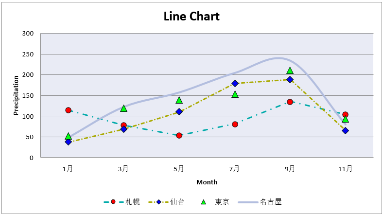
The result of executing the sample code up to this point is shown in Figure 9.
Decorated with titles and marker lines.
The results of <List1> can also be downloaded below.
4. Implement “LineChart3D(3D)”

In addition to the usual planar graphs introduced so far, we can also handle three-dimensional (3D) line charts. For a 3D graph, get the LineChart3D object from the LineChart3D class. In other words, replace lines 4 and 13 of <List1> with <List5>.
# Importing the "LineChart3D class" of a 3D line chart
from openpyxl.chart import LineChart3D

#--------------- Same as <List1> on the way -----------------

# Obtain a Chart object
c1 = LineChart3D()

#--------------- Same as <List1> on the way -----------------
Otherwise, it is almost the same as the usual way of making planar graphs. The key points are as follows.
・The series can be obtained with the Series object, and the line format can be specified individually. (same as 2D)
・Markers cannot be set.
・Three types (standard, stacked, and 100% stacked) can be set using the grouping property. (same as 2D)
・The legend is not necessary but can be set itself, since the series name is displayed in the plot area. (same as 2D)
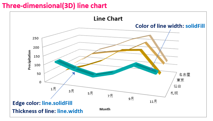
The following <List6> is an example of formatting a series (Series object).
In a 3D graph, you cannot set markers, but you can specify line edges and color and width (thickness) as shown in <List6>. Note that other 2D settings such as line type (dashStyle attribute), smooth curve (smooth attribute), and no line (noFill) are not reflected in the 3D settings.
# <Series Object 1> -----------------------------------------------------------
ser1=c1.series[0]

# Line setting
ser1.graphicalProperties.solidFill = '00AAAA'         # Set the line width color
ser1.graphicalProperties.line.solidFill = '00AAAA'    # Set the line edge color
ser1.graphicalProperties.line.width = pixels_to_EMU(2.5)    # Set line thickness Specify with EMUs
An example of a 3D line chart with <List5><List6>is shown below.
The line format specified for the three-dimensional representation and is reflected.
5. Line Chart Type and Style <Appendix>

So far, we have explained the specific procedures for line charts with sample code.
This section provides additional information on other “Forms” or “Styles” of line charts.
5.1 About Line Chart Type
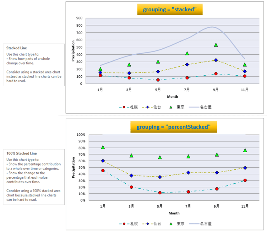
As shown in Figure4, there are three types of line chart forms: “standard” “stacked” and “100% stacked“. For each, specify “standard“, “stacked“, and “percentStacked” in the grouping attribute under the LineChart object.
Insert the <List7> following between <List1> and <List3>.
# Set the form of the graph
# Select one of the following three options

# "standard" (default)
c1.grouping = "standard"

# stacked"
c1.grouping = "stacked"

# "percentStacked"
c1.grouping = "percentStacked"
Since “standard” is the same as in Figure 9 above, the execution results when “stacked” and “percentStacked (100% stacked)” are specified are shown below. (Fig11)
5.2 How to set Style
As mentioned briefly in the explanation of , the LineChart object has the style attribute that allows you to apply the default “Built-in Style“.
There are a total of 48 pre-prepared built-in styles.
The following <Table3> and <Table4> summarize all 48 style formats. You can choose from a combination of “line color” “width” “plot area tint” and “overall graph tint”.
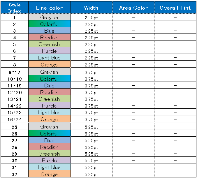
Figure12 shows an example in which the Style attribute is set to 4 (left), 11 (center), and 26 (right) from the list of styles in <Table3>.

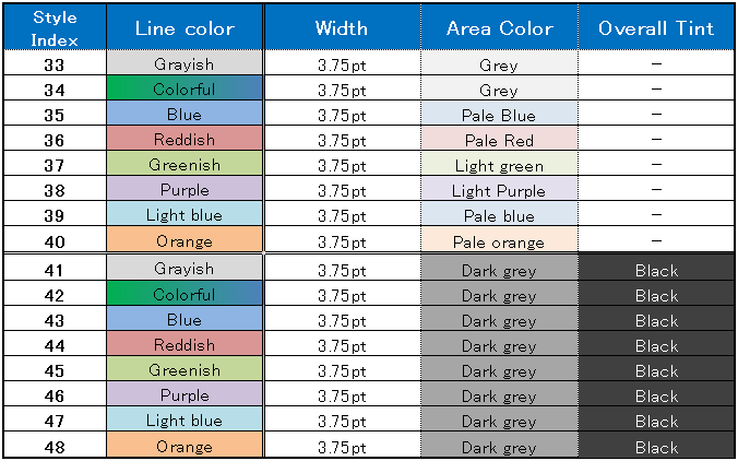
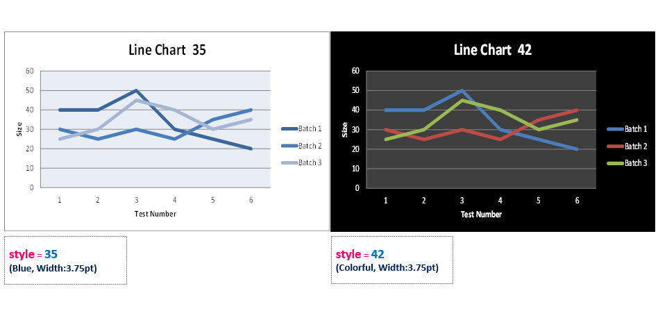
Figure 13 shows an example of setting 35 (left) and 42 (right) as Style attribute from the list of styles in <Table4>.
They are all simple in appearance, easy to handle, and useful for quick graph design.
In addition, if “lines” or “markers” are set individually for each series by the Series object, they will take precedence.
6. Summary

How was it?
Introduced the procedure for creating “Line Chart” using “openpyxl” an external library for manipulating Excel, with actual examples.
Although some points may have been difficult to understand from the previous explanation of classes and objects, we hope that by reading the actual code, you feel that your understanding has deepened.
In addition, there are some patterns in the code for creating charts, so please use the sample code introduced as a reference and try to arrange it.
There are many other types of graphs in Excel besides “Line” graphs. The following is an explanation focusing on commonly used types such as “Bar Chart” “Scatter plot” and “Bubble Chart” etc. Please refer to this page as well.
Let’s summarize what we have so far.
1. The following two points should be noted when defining a line chart, a type of graph in which multiple series share the same category.
・Acquire data reference information in a batch by grouping them in a Reference object.
・It is not possible to add series data individually in a Series object. (It is not possible to add a specific series later.)
2. To specify individual lines and markers in a “line graph,” access each series information (Series object) and set them in the corresponding object.
(The line and marker property are used to obtain objects for line and marker, respectively.)
3. In addition to the normal planar type, there are three-dimensional (3D) types of “line graphs,” each of which has its own class. The form includes “standard” “stacked” and “100% stacked” which can be specified with the group property.
Thank you for reading to the end.