This article describes the “openpyxl” library for manipulating Excel with Python.
Since Excel is equipped with many functions, it is impossible to cover everything in a single article. The articles are divided by major items (functions) and summarized as a series of articles 【Python x Excel】.
In previous articles in this series, we have covered the essentials of using openpyxl. Please refer to the related articles as well, as some prerequisite knowledge is required to read the following explanations.
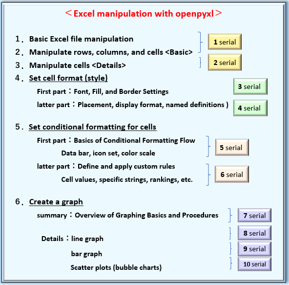
For information on creating and saving a book, adding a worksheet, and then getting and manipulating rows, columns, cells, and objects, please refer to <articles 1 and 2> in this series.

Cell formatting (fonts, borders, and other decorations) is explained in <articles 3 and 4> in this series.
Now, in this “the seventh article in the series”, we will provide an overview of the “Procedure for Inserting Graphs into Excel“. Graphs play a crucial role in “data visualization”.
For example, it may be common to summarize monthly sales data in a standardized graph format to visualize trends.
Since graphs are one of the main functions of Excel, openpyxl also provides many classes and methods related to graphs.
If you can automate Excel graphing programmatically, you can finish troublesome routine tasks in an instant. The fact that it can be operated in Python, which is a perfect companion to Excel, should not be overlooked.
As you know, there are many types of graphs that Excel can handle.
Since it is difficult to cover all of them in a single article, we will again divide the explanation into several parts: [Overview] and [Practical].
[Overview] We will focus on the flow of graph creation, detailed specifications of required classes, and object hierarchies.
[Practical] We will introduce examples and tips for creating each type of graph, such as “line graphs”, “bar charts”, and “scatter plots”.
Please stay with us until the end of this article, as you will be able to “do and understand” the following.
The information presented on this site is only an example. Please refer to the official website for details and clarifications, if necessary.
【Official Site】:https://openpyxl.readthedocs.io/en/stable/
From the next section, we will provide concrete explanations of the “basics of graph creation” and “procedures (flow) for each graph type” using openpyxl.
1. Basic of Graph in openpyxl

Excel allows you to create line, bar, scatter, pie, and other types of graphs that are ideal for a variety of uses. This section describes the “basic concept” and “procedure (flow)” for creating graphs using openpyxl.
First of all, let’s organize here the basic items of graph creation: “Unification of terminology” and “elements that compose a graph”.
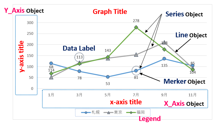
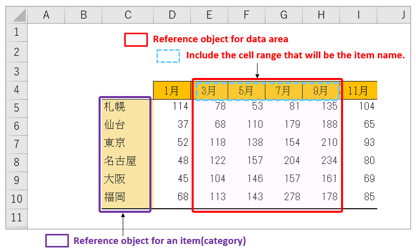
Fig2 below shows an example of drawing a line graph from a table of precipitation for a given year for each city, with the horizontal axis (X-axis) representing the month and the vertical axis (Y-axis) representing the amount of precipitation.
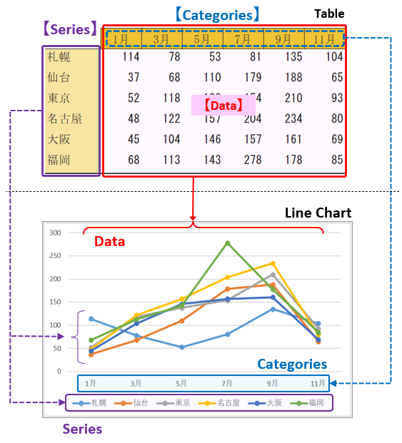
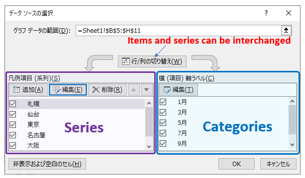
Generally, in Excel, the elements on the horizontal axis (X-axis) are called 【Items】 or 【Categories】. (in the blue box)
In addition, there are several overlapping line graphs by city in the graph plot area, and these elements are expressed as【Series】. (in the purple box)
In Excel, items and series are freely interchangeable. Therefore, it is necessary to always be aware of whether the matrix in the table specifies “items” or “series (categories)” when creating a graph.
Then, individual elements, uniquely determined by the “item name” and “series name,” are displayed as【data】in the plot area. (in the red box)
Furthermore, below (Figure 3) is the edit window (data selection) of a graph in Excel. The left side refers to the data in “Series” and the right side refers to the data in “Item (Category),” and the reference range for each can be set using the “Edit” buttons.
In the following sections, based on this prerequisite knowledge of graphs, specific “handling of various objects” and “procedures for creating graphs” will be explained in detail.
1.1 Component of Graph (Object)
The elements that make up the graph are shown in Fig4.
While some elements, such as the title, legend, and X (Y) axis, are common to all types of graphs, others, such as markers, lines, and labels in the plot area, vary depending on the type of graph.
Creating a graph programmatically means setting the necessary data and attributes for each of these components.
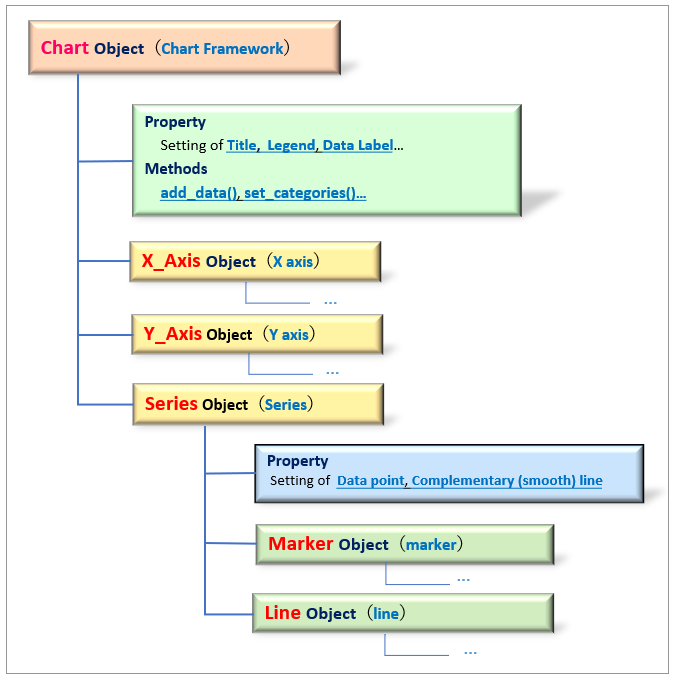
Excel has a hierarchical structure with classes (objects) such as “Workbook,” “Worksheet,” “Row/Column” “Cell” and so on. <Related Article>
The same is true for graphs, which have a layered structure with the Chart object, the main body of the graph, at the top and various classes (objects) under it, as shown in Fig5.
Some components, such as title and legend, can be set and retrieved by attributes directly under the Chart object, while others, such as X (Y) axis and series data, require awareness of the parent-child relationship between objects.
We will discuss graph element objects in more detail in the sections that follow.
Now that you have an overview of graphs, the next section describes the procedure (flow) for creating graphs.
1.2 Overview of Graphing Procedure
This section describes the procedure (flow) for creating graphs.
The general procedure is the same for any type of graph, and can be easily summarized in the following three steps.
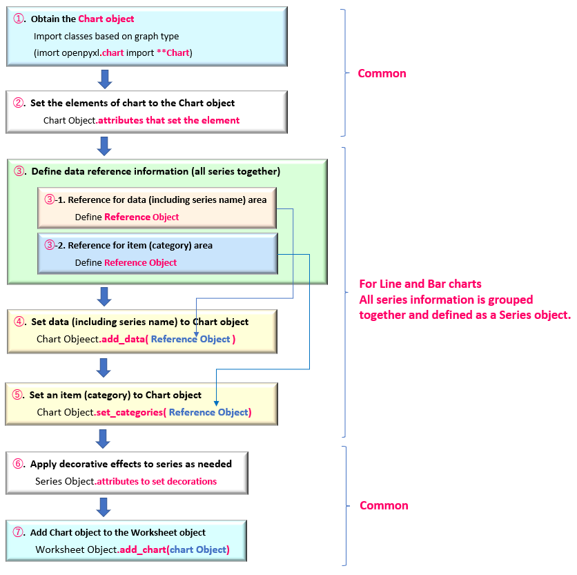
➀. Obtaining the Chart object
➁. Define objects that reference “data” and “categories” and set them to Chart objects(➀).
➂. Add Chart object(➁) to the Worksheet object .
Let me subdivide the procedure a little more.
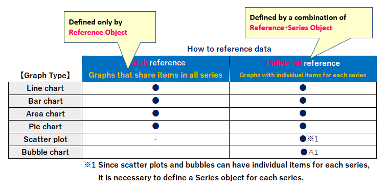
For the part about defining objects that refer to “data” and “categories”(➁). There are two ways depending on the type of graph (line chart or scatter graph etc).
The first way defines Reference object by grouping multiple series data together at once.
It can be applied to any type of graph that shares a common item (X-axis) in all series. (line graph, bar graph, etc.)
Second, for each individual series data, you can define Reference object for each item (X-axis) reference data and Y-axis reference data, and combine them into Series object.
In other words, it can be applied to any type of graph where different item (X-axis) values can be specified for each series. (Scatter plots, bubble charts, etc.)
Of course, the same item (X-axis) values can be referenced in all series, so all graph types can be supported.
Based on the fact that there are two types of objects that manage data reference information, the Reference object and the Series object. The procedure for creating a graph will be explained from the next section.
1.2.1 Reference to Multiple Series at once
For line, bar, and other types of graphs in which each series shares the same item (X-axis value), all series data can be referenced together as the Reference object.
The graphing procedure is shown in Fig7.
This section describes the blocks (➀~➆) in Fig7.
➀.【Obtain Chart Object】
The Chart object is the framework of the graph.
Dedicated classes is provided for each type of graph. For example, for a “Line chart,” a LineChart object is obtained from the LineChart class.
➁.【Add Graph Elements to the Chart Object】
The elements that make up a graph include the title, legend, and axis titles.
These are added and set by the attributes (properties) under the Chart object.
➂.【Define Reference Data as the Reference Object】
Define cell ranges referenced by the graph as the Reference object. There are two cell ranges to be referenced: “data area including series name” and “item name“. (Fig.8)
For the Reference class, see <Sec 2.2>
➃.【Set Data in the Chart Object】
Add the Reference object that points to the data area defined in ➂ to the Chart object with the add_data() method.
➄.【Set Item name(Category) to the Chart Object】
Add the Reference object that points to the item name (category) defined in ➂ to the Chart object with the set_categories() method.
➅.【Apply Decorating Effects to each Series Data】
Individual series data in a graph are managed as the Series objects. Decorative effects in the plot area, such as markers, lines, and fills, are set in the attributes under the Series object.
The Series object can be obtained with the series property of the Chart object.
➆.【Insert Graph into the Worksheet】
Finally, the Chart object defined so far and the insertion position of the chart are specified in the argument of the add_chart() method of the Worksheet object, and inserted into the worksheet.
The format of the add_chart() method is as follows
Worksheet Object.add_chart(chart, cell_Adr)
arg: chart : Specify the chart object to be inserted
arg: cell_Adr: Specify the position to insert the graph ‘A1’, ‘B10’, etc.
1.2.2 Define ”Reference Object” for each Series
In the case of a type of graph that allows different items (X-axis values) to be set for each individual series, such as a scatter or bubble chart, it is not possible to batch reference multiple series together, as described in <Sec1.2.1>.
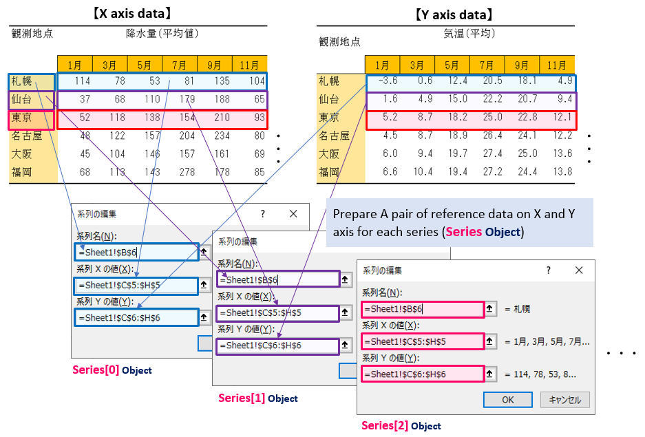
For each series, an item (X-axis data) and its corresponding value (Y-axis data) are combined and managed as the Series object. (The respective values for the X and Y axes are defined as Reference object in the same way.)
The graphing procedure is shown in Figure9.
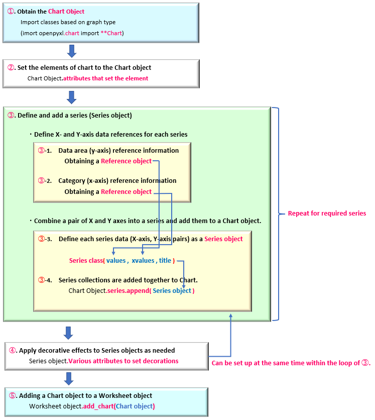
Only those blocks that differ from the procedure in <Sec1.2.1> “Referencing to multiple series at once” are explained in the following sections.
➂.【Define reference information for each series data】
Since different items (X-axis values) can be specified for each series, “reference data for X-axis values” and “reference data for Y-axis values” are defined for each series in the Reference object. (②-1, ➁-2)
The individual series data are combined into the Series object in the Series class, which is associated with the “Reference object” for the X and Y axes by series name. (②-3)
All series data in a graph (Chart object) are managed in the Series collection.
The series.append() method is used to add to the collection. (②-4)
The flow in ➁ needs to be repeated for each series, so iterative processing is executed with For and While statements, etc.
The Series class/collection will be explained later in <Sec 2.3>.
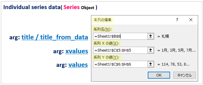
Figure10 below shows adding a series in Excel’s Edit Series window. For each series, a reference range of “series name,” “series X value (X),” and “series Y value (Y)” is set, and the same thing is done when acquiring Series objects.
The add_data() method of <Sec1.2.1> is no longer necessary. If the object is obtained by specifying the series name as the argument of the Series class, the set_categories() method is also unnecessary.
This is about “Graph Composition Objects” and “How to create a graph using openpyxl”. From the following sections, we will summarize the specifications of various classes and attributes.
2. More about Objects that make up Graph

Up to this point, we have outlined the layer structure of the objects that make up a graph <Sec 1.1> and the steps (flow) for creating a graph <Sec 1.2>.
This section reiterates the detailed class specifications required for graph creation. The main “objects” and “methods (attributes)” under the classes are also explained.
2.1 About the Chart object
The Chart object, which is the framework of a graph, has dedicated classes for each type of graph (line, bar, scatter, etc…).
For example, for a typical “Line Chart”, a Chart object can be obtained from the LineChart class as follows. Other Chart classes for graphs will be introduced in <Sec 3>.
<Line Chart>
from openpyxl.chart import LineChart
LineChart(marker, smooth)
arg: marker :Set with or without marker(defaultNone) True:marker enabled / False:Marker invalid
arg: smooth :Set a Smooth Line(defaultNone) True:Enable/ False:Disabled
Many other optional arguments, all optional
return: Chart Object
In the next section, “methods (attributes) for setting data” and “attributes for adding and setting graph components such as titles and axes” are explained individually.
2.1.1 Set data to Chart Object
First, we will discuss the methods and attributes for setting the data (including series and item names) to be plotted. As explained in <Sec 1.2>, there are two ways to set up the data, depending on how the items (X-axis) of each series are shared.
The add_data() method is used to set data for a graph with shared items, and the set_categories() method is used to set item names, in the following format.
<Set Data (Y value)>
Chart Object.add_data(data, titles_from_data)
arg: data : Set data reference information (Reference object)
arg: titles_from_data: Whether the first data is a category (series name) or not
(True(Set to series name)/False)
<Set Item (X value)>
Chart Object.set_categories(data)
arg: data : Set item name reference information (Reference object)
The arg:data of the two methods is set to the Reference object, which is the reference information of the cell. (see below for details)
Also, specify “True” for the arg:titles_from_data of the add_data() method if you want the first element of each column of the reference source to be the series name. Default is “False” (do not refer to it as a series name). (See Figure8)
In addition, the Chart object has a very important attribute called series. This returns a Series collection that summarizes all the series information a graph has.
The desired series information (Series object) can be obtained individually by specifying the index. Series collections can also be iterable to retrieve individual objects sequentially (with a For-in syntax). (Series objects are discussed below.)
To add a new Series object to the collection, use the append() method .
<Get Series (collections)>
Chart Object.series property
return: Series Collection
[index] Individual Series objects can be acquired by specifying index.
<Get a Series (individual)>
Chart Object.series[index]
arg:index: Individual Series objects can be acquired by specifying index.
return: Series Object
<Add Series (individual)>
Chart Object.series.append(series)
arg: series : Specify the series data information (Series object) to be added
These are the methods to set/get data (series data) in the Chart object.
2.1.2 Add and Set Component to Chart Object
A graph has other components besides the plot area where data is displayed, such as the “title,” “legend,” and “X, Y axes. (Fig4/5)
These can be set and retrieved by various attributes (properties) under the Chart object. The main ones are summarized in <Table1> below.
| 【Chart Object.attribute name】 | 【functions】 | 【Other and related objects】 |
|---|---|---|
| title property | Obtain and set the title of a graph | |
| style property | Obtain and set graph styles | Specified by integer |
| legend property | Enable/disable the legend | Disabled by None (default is enabled) |
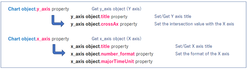
| y_axis property | y_axis Object(Y-axis) is obtained | Main attributes of y_axis object ・title property(Set/Get Y-axis title) ・crossAx property(Set the intersection value with the X axis) |
| x_axis property | x_axis Object (Y-axis) is obtained | Main attributes of the x_axis object ・title property(Set/Get X-axis title) ・number_format property(Set the format of the X axis) |
| series property | Retrieve the Series collection | Main attributes of the Series object ・marker property(Set the marker) ・graphicalProperties property(Set colors and lines) |
Elements such as title, style, and legend can be set and retrieved by attributes directly under the Chart object.
On the other hand, for axes (X/Y) and series, after each object is obtained with the above attributes, it is further accessed in the attribute layer below. (Fig11)
Plot area elements such as “series,” “markers,” “labels,” and “lines” are handled by attributes under the Series object. This is explained in the Series object in <Sec 2.3>.
The above explains the “methods for setting data” and “attributes for adding and setting components” for the Chart object.
2.2 Manage Reference Information(Reference Object)
Reference information for cell ranges, such as graph data (including series names) and items (categories) is managed by the Reference object.
There are two ways to specify the reference range of cell.
There are two ways of specifying row and column numbers in the 2nd~5th arguments (see Fig.12), and using a string ( ‘A1:C3’) in the 6th arg:range_string. Note that in the former case, the “A1” cell is the first row(1) and the first column(1).
from openpyxl.chart import Reference
Reference(worksheet, min_col, min_row, max_col, max_row, range_string)
arg: worksheet : Specify the Worksheet object to be referenced(default:None)
arg: min_col : Specify the reference source start column number as an integer(default:None)
arg: min_row : Specify the reference source start row number as an integer(default:None)
arg: max_col : Specify the reference source stop column number as an integer(default:None)
arg: max_row : Specify the reference source stop row number as an integer(default:None)
arg: range_string : Specify the address range of the reference source as a string(default:None)
return: Reference Object
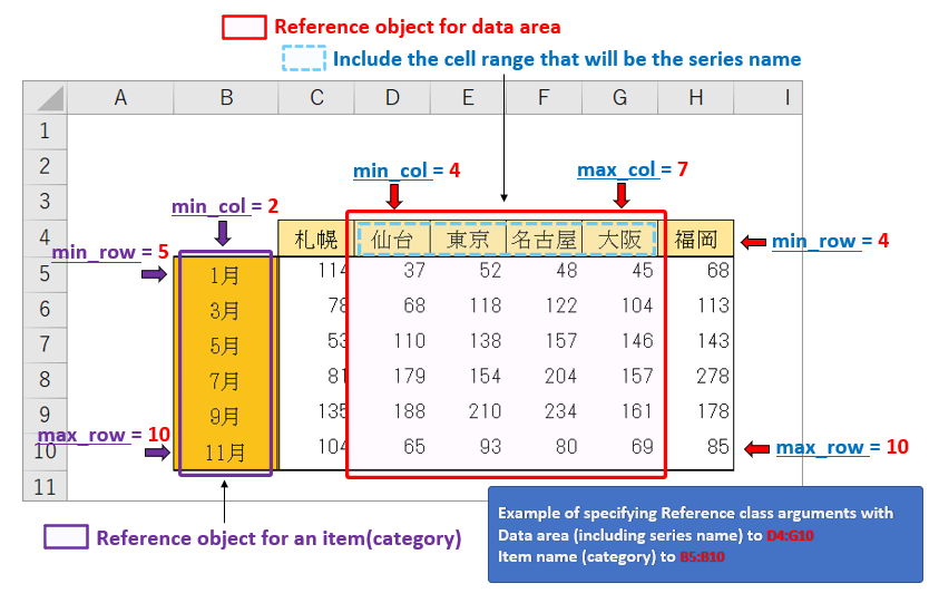
If the arg:titles_from_data of the add_data() method of the Chart object is set to “True” (valid), the element (※) in the first line is recognized as the series name. For example, in the table shown in Fig12, “D4~G4” is the series name.
※ The arg:titles_form_data allows only the first element in the first row to specify the series name, not the first column. So the table must be arranged as shown in Fig12.
2.3 Manage Series data (Series Object)
Individual series data are handled as the Series object to be acquired in the following format.
The first to third arguments specify the cell range information (Reference object) referenced by the Y, X, and Z axes, respectively. The third arg:zvalues is used only when a three-dimensional representation is required, such as the “Bubble Chart”.
The first element of the first line of the argument values can be used as the series name by setting the fifth arg:title_from_data to “True“. Or can be specified directly as a string in the fourth arg:title. (Same usage as add_data() method)
from openpyxl.chart import Series
Series(values, xvalues, zvalues, title, title_from_data)
arg: values : Specify a Y-axis reference data(Reference Object)
arg: xvalues: Specify a X-axis reference data(Reference Object) (default:None)
arg: zvalues : Specify a Z-axis reference data(Reference Object) (default:None)
arg: title: Specify a series name(default:None)
arg: title_from_data : Specify the first data of arg:values as the series name (default:False)
return:Series Object
The relationship between the Excel series edit window and each argument is shown in Figure13.
The Series object has a tree structure with many attributes and related (child) objects under it. As shown in Fig.14, you can set and retrieve individual elements such as markers (Marker object), lines (Line object), and labels associated with the plot area of a graph.
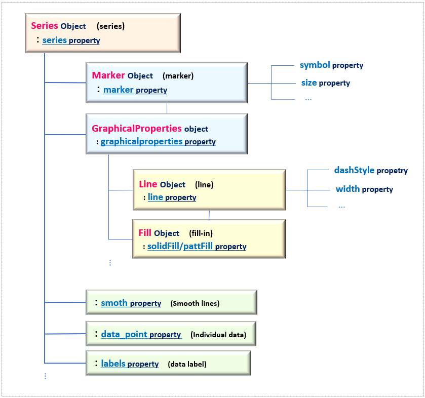
The main attributes under the Series object are summarized in <Table2>.
| 【Series Object.attribute】 | 【Functions】 | 【Other and related objects】 |
|---|---|---|
| marker property | Obtain Marker Object | See Table3 |
| graphicalProperties.solidFill property | Obtain Fill Object | See Table5 |
| graphicalProperties.line property | Obtain Line Object | See Table4 |
| smooth property | Drawing smooth lines | True(valid)/False(invalid) |
| labels property | Set data labels | DataLabelList Object |
| data_points property | Set point data | Add by list or append method |
This is all about the Series class (object). In the following sections, we will introduce the ”Marker object”, ”Line object”, and ”Fill object”, which are important objects under the Series object. Other attributes will be introduced in the explanation of each individual graph type.
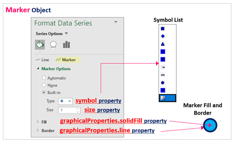
2.3.1 Marker (Marker object)
Markers such as line graphs are managed by the Marker object under Series objects. Marker objects can be obtained from the marker attribute.
As shown in <Table 3> below, the Marker object has many attributes that can be used to set and retrieve the shape (symbol), color, and size of the marker.
| 【Marker Object.attribute】 | 【Functions】 | 【Other and related objects】 |
|---|---|---|
| symbol proterty | Set the shape of the marker | ’triangle’ ,‘plus’, ‘diamond’ etc… |
| size property | Set marker size | Floating point such as 7.0 |
| graphicalProperties.solidFill property | Fill in marker | Set by RGB specifications such as “FF0000” or ColorChoice Object |
| graphicalProperties.line.solidFill property | Color of marker border | Set by RGB specifications such as “FF0000” or ColorChoice Object |
The shape of the marker specified in the symbol attribute can be selected from among {‘plus’, ‘diamond’, ‘square’, ‘dash’, ‘dot’, ‘x’, ‘auto’, ‘circle’, ‘star’, ‘picture’, ‘triangle’}.
In addition, graphicalProperties attribute and line attribute are used to set the internal fill and border of the marker. The Line object will be explained later.
The correspondence between the Excel marker settings window and each attribute is shown in Fig15.
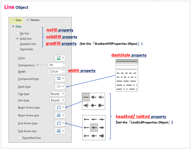
2.3.2 Line (Line object)
In openpyxl, information about the color, width, line type of “Line of a line chart” and “Border (edge) of marker etc…” is managed as the Line object.
Line objects are obtained from Series objects in the hierarchical order of graphicalProperties attribute to line attribute.
As in the case of the previous marker(Marker object), the graphicalProperties attribute is connected directly to the target object (Without going through the Series object).
However, all attributes below the Line object are common regardless of the parent object. The main attributes are summarized in <Table4> below.
| 【Line Object.attribute】 | 【Functions】 | 【Other and related objects】 |
|---|---|---|
| solidFill property | Set line color | Set by ColorChoice object ,or RGB specification such as “00AAAA” |
| dashStyle property | Set the line type | Set the specified value such as “sysDot” etc |
| width property | Set line thickness | Convert and set units in EMUs or in the util module |
| noFill property | erase a line | True(valid)/False(invalid) |
The line type is specified by the dashStyle attribute, and the built-in styles {‘sysDashDot’, ‘dashDot’, ‘sysDash’, ‘dash’, ‘dot’, ‘lgDashDotDot’, ‘lgDashDot’, ‘sysDot’, ‘sysDashDotDot’, ‘solid’, ‘lgDash’} are available.
The color and thickness of the lines are set using the solidFill and width attributes, respectively. noFill attribute can also be used to hide the lines.
The Line object has numerous other attributes. Fig16 shows the Excel line setup window, which also provides attributes such as the shape and size of the starting and ending points.
For more detailed specifications, please refer to the following official documents.
Official Documents<openpyxl.drawing.line module>
https://openpyxl.readthedocs.io/en/stable/api/openpyxl.drawing.line.html#openpyxl.drawing.line.LineProperties
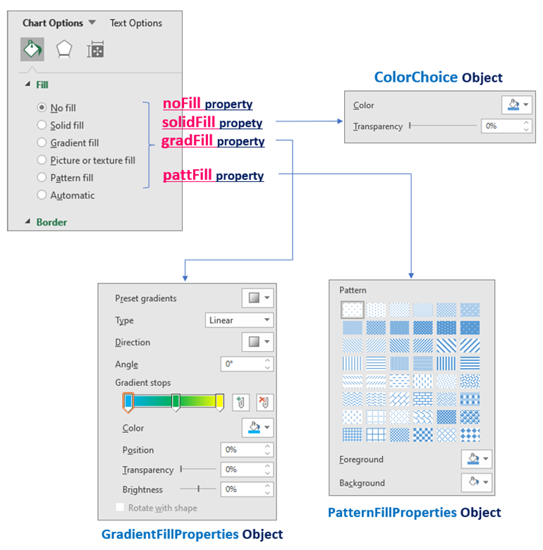
2.3.3 Fill effect (Fill object)
We have already introduced the solidFill attribute (<Table3,4>) to fill “Marker” and “Line” objects with a single color, but the fill effect can be applied not only with a single color but also with a pattern or gradation.
Fill is applied by connecting the graphicalProperties attribute under the target object with the desired effect (single color, pattern, gradient). In summary, the following Table5 is shown.
| 【GraphicalProperties Object.attribute】 | 【Functions】 | 【Other and related objects】 |
|---|---|---|
| solidFill property | Fill with a single color | Set by <ColorChoice Object>in addition to RGB specification such as “00AAAAA“ |
| pattFill property | Pattern Fill-in | Set by<PatternFillProperties Object> |
| gradFill property | Gradient Fill-in | Set by<GradientFillProperties Object> |
| noFill property | No fill-in | True(valid)/False(Invalid) |
Objects obtained from the dedicated class that defines fill-in information are set to the above attributes. Define and set PatternFillProperties object for pattern effects and GradientFillProperties object for gradient effects.
Fig17 shows the Excel Fill Settings window and the relationship between each attribute.
Specific settings will be explained as needed within the sample code in the individual articles for each graph.
The above is an explanation of the individual objects that make up a graph. In the next section, we will introduce the types of graphs provided by openpyxl and the Chart object for various types of graphs.
3. Graph Type(Chart Object)

openpyxl supports all types of graphs that can be created in Excel. A dedicated class is provided for each type, and the main frame(framework) of the chart is managed by the Chart object.
This section introduces the Chart class for typical chart types and describes special properties and key points in each Chart object. (I will leave the explanation of the graphs themselves to specialized Excel books.)
Also, examples of each program are discussed in separate articles.
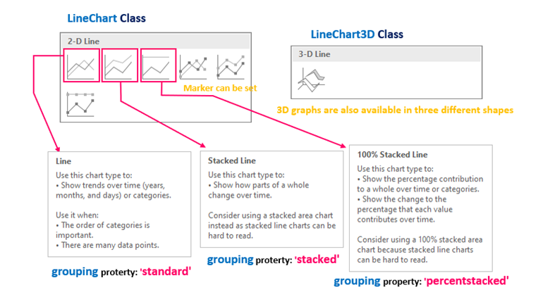
3.1 Line Graph
This is the most common type of graph in which pairs of data are plotted on the X-axis (item names) and Y-axis (values), and lines are drawn between each plot. Data can be referenced in a batch by grouping all series information together in the Reference object. (Individual references by Series objects are also possible.)
The difference from scatter plots is that the x-axis value is shared by each series.
The following two classes are available for defining line charts: LineChart class (2D) and LineChart3D class (three-dimensional).
<Line Chart>
from openpyxl.chart import LineChart
LineChart(marker, smooth)
arg: marker : Set with or without marker (default:None) True:valid /False:Invalid
arg: smooth : Setting Smooth Lines (default:None) True:Valid/False:Invalid
There are many other optional arguments
return: LineChart Object
<Line Chart(3D)>
from openpyxl.chart import LineChart3D
LineChart3D(gapDepth, marker, smooth)
arg: gapDepth : Adjust the depth of the floor (default:None)
arg: marker : Set with or without marker (default:None) True:Valid/False:Invalid
arg: smooth : Setting Smooth Lines(default:None) True:Valid/False:Invalid
There are many other optional arguments
return: LineChart3D Object
In addition, the grouping attribute of the Chart object allows you to select a graph form from among “standard“, “stacked“, and “percentstacked“.
A description of each type is shown in Fig18.
The specific procedure for creating a line chart is explained in detail with sample code in the following article. Please refer to this article as well.
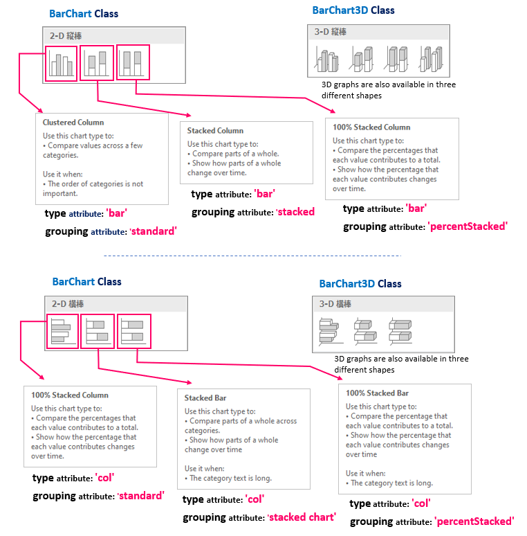
3.2 Bar Graph
As with a line chart, the X-axis (item) takes a common value for each series. Therefore, the data referencing method is to group all series information into a Reference object and reference them all at once. (Individual references by Series objects are also possible.)
The following two classes are available for defining bar charts: BarChart class (2D) and BarChart3D class (3D).
<Bar Chart>
from openpyxl.chart import BarChart
BarChart(gapWidth, overlap)
arg: gapWidth: Adjust the spacing between series (default:150)
arg: overlap: Adjustment of stacking overlap (default:None)
There are many other optional arguments
return: BarChart Object
<Bar Chart(3D)>
from openpyxl.chart import BarChart3D
BarChart3D(gapWidth, gapDepth, shape)
arg: gapWidth: Adjust the spacing between series (default:150)
arg: gapDepth: Adjust the depth of the floor (default:150)
arg: shape: Specify bar shape (default:None)
There are many other optional arguments
return: BarChart3D Object
The type attribute of the Chart object allows you to select the orientation of the bars from “col” (horizontal bars) and “bar” (vertical bars). Note that the X and Y axes are inverted when the type attribute is set to “col”.
In addition, the grouping attribute of the Chart object allows the user to select from three types of chart forms: “standard“, “stacked chart“, and “percentStacked“. You can select from among three types.
Also, assuming that it is a stacked bar chart, the Chart object has the overlap attribute that allows you to adjust the degree of overlap of adjacent bars in percentage units.
Description of each type is shown in Fig19.
The specific procedure for creating bar graphs is explained in detail with sample code in the following article. Please refer to this article as well.
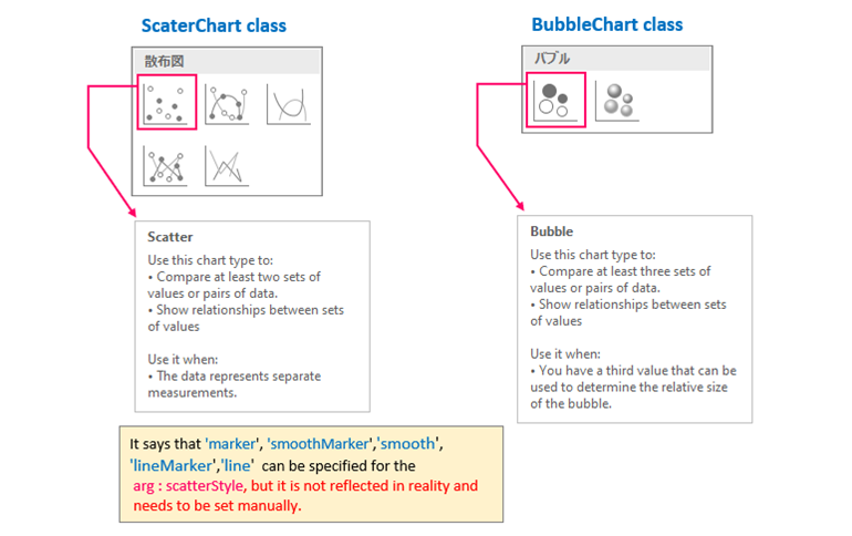
3.3 Scatter plots/Bubbles
he scatter chart (bubble chart) differs from a line chart in that the X-axis values (item names) can take on different values for each series. (Of course, there is no problem if all series refer to the same item.)
As such, scatter plots should define a Series object for each series as in <section1.2.2>.
The scatter chart gets Chart object from the ScatterChart class, and the Bubble chart gets Chart object from the BubbleChart class.
<Scatter>
from openpyxl.chart import ScatterChart
ScatterChart(scatterStyle)
arg: scatterStyle : Specify the form of the scatterplot(defaultNone)
Options {‘smoothMarker’, ‘marker’, ‘lineMarker’, ‘smooth’, ‘line’}
return: ScatterChart Object
※ There are many other optional arguments
<Bubble Chart>
from openpyxl.chart import BubbleChart
BubbleChart(bubble3D, bubbleScale, showNegBubbles, sizeRepresents)
arg:bubble3D: Setting of whether or not the representation is in 3D (default:None) True(3D)/False(2D)
arg:bubbleScale: Setting Bubble Size (default:None)
arg:showNegBubbles: Enabling/disabling shadow effects on bubble (default:None) True(valid)/False(invalid)
arg:sizeRepresents: Specify how the bubble size is reflected (default:None) {‘area’(area size), ‘w’(width)}
return: BubbleChart Object
※ There are many other optional arguments
The form of the graph is shown in Figure20.
In addition to plotting with a Marker object, scatter plots can also be connected by lines using the line attribute (straight line) and smooth attribute (smooth line).
More flexible line graphs can be created by taking advantage of the ability to set values (items) on the X-axis for each series.
The specific procedures for creating scatter and bubble charts are carefully explained with sample code in the following article. Please refer to this article as well.
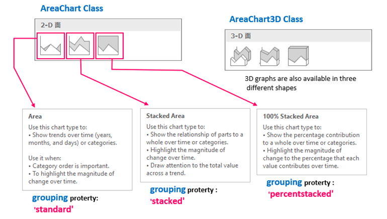
3.4 Area Graph
Area graphs are graphs with the bottom part of the line filled in,and the method of generation and attributes used are similar to those of a line graph.
There are also two classes for defining area charts: AreaChart class (2D) and AreaChart3D class (three-dimensional).
<AreaGraph (2D)>
from openpyxl.chart import AreaChart
AreaChart()
return: AreaChart Object
※ There are many other optional arguments
<AreaGraph (3D)>
from openpyxl.chart import AreaChart3D
AreaChart3D(gapDepth)
arg: gapDepth :Adjust floor depth (default 150)
return: AreaChart3D Object
※ There are many other optional arguments
In addition, the grouping attribute of the Chart object allows you to select a graph form from among “standard“, “stacked“, and “percentstacked“.
The description of each type is shown in Fig21.
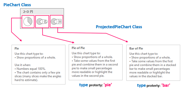
3.5 Pie Chart
The pie chart shows the percentage of items (categories) in a circular form. Each item (category) is ordered clockwise with 0° at the top.
Standard pie charts can be defined in the Piechart class and there is also the ProjectedPieChart class that can be used to add auxiliary pie and bar charts to the standard pie chart.
<Pie Chart>
from openpyxl.chart import PieChart
PieChart(firstSliceAng)
arg: firstSliceAng : Specify the angle of the beginning of the pie chart in clockwise direction with Top as 0°.
return: PieChart Object
※ Many other optional arguments, all optional
<Pie Chart (extracted)>
from openpyxl.chart import ProjectedPieChart
ProjectedPieChart(ofPieType, splitType)
arg: ofPieType : Select auxiliary chart type {‘pie’(pie chart), ‘bar’(vertical bar)}
arg: splitType : Select extraction patterns for auxiliary graphs {‘percent’, ‘cust’, ‘pos’, ‘auto’, ‘val’}
return: ProjectedPieChart Object
※ Many other optional arguments, all optional
The data_points attribute of the Chart object can be used to crop and highlight a portion of pie chart.
You can also select the auxiliary pie (bar) using the type attribute of the ProjectedPieChart object. The “pie” type is used for auxiliary pie and the “bar” type is used for stacked bar chart.
4. Summary

How was it?
This is a summary of the procedure for creating graphs and necessary classes (objects) in “openpyxl”.
The chart module of the openpyxl library provides many classes for manipulating graphs, but the ones introduced here are essential tips that must be mastered.
Also, although the specific program is not posted this time, the outline of the procedure for any type of graph is as follows.
➀. Obtain the Chart object.
➁. Obtain the “Reference object” for data category and set it to the “Chart object”.
There are two ways to obtain the Reference object.
➁-1:「Type in which all series share the same item」
→ Set up the Reference object that groups all the series together.
➁-2:「Type that takes different items in each series」
→ Define and set the Series object for each series
➂. Add the Chart object(➁) to the Worksheet object.
How the above steps are put into concrete code will be explained in the next article.
Graphs are essential for data visualization.
We hope this article will help you to create graphs with openpyxl.
Thank you for reading to the end.