In this article, we will continue to introduce the “python-pptx” library, which provides functions to operate “PowerPoint” from Python.
Please refer to the following table of contents for the series.
In the business scene, there may be many needs to visualize the distribution of numerical values and time trends.
For example, when you want to perform “marketing” or “statistical data analysis” such as monthly sales trends or the number of products sold by age group.
There are various ways to visualize data, such as “Shapes” “Tables” and “Graph” but the author believes that the most effective element among these is “inserting Graph” on the slide.
By the way, what kind of tools do you use to make graphs?
Most of the time, when creating documents for PowerPoint, you probably create graphs in Excel and then paste them onto slides.
Still, it’s not entirely wrong, but…
Wouldn’t it be more convenient if you could automatically draw graphs with PowerPoint alone, without having to go back and forth between the two applications (Excel→PowerPoint)?
Therefore, in this article, we will show you how to create and insert PowerPoint graphs using only python-pptx.
By reading this article you will learn the following.
Now, we will begin explaining specific graphing procedures in the next section.
The usage of various classes and functions introduced in this article is just an example. Please refer to the “Official Documentation” below for details and clarifications.
python-pptx Official Documents(API Document)
https://openpyxl.readthedocs.io/en/stable/
1. Create a Graph (Chart object)

In this section, we will describe the steps to create a graph on a slide using python-pptx.
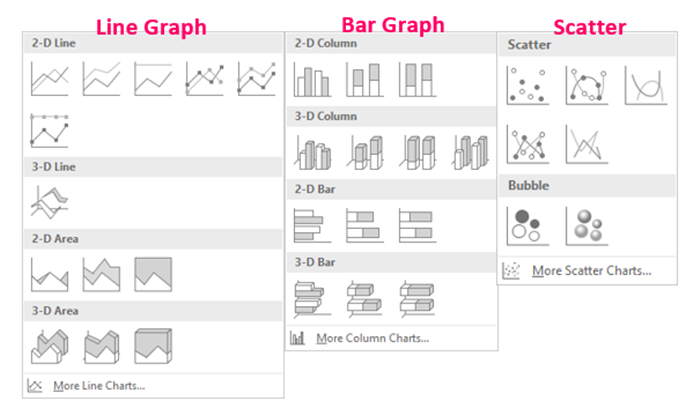
Almost all types of graphs can be handled by python-pptx, with the exception of three-dimensional (3D) graphs. The procedure for creating “Data (ChartData object)” (see below) differs for each type, but the outline of the procedure is the same for all types.
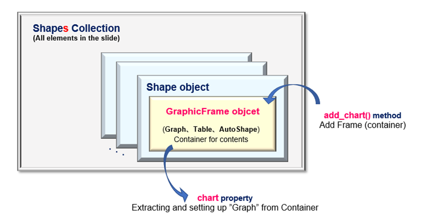
First, let us explain the flow of graph creation. (Fig.1) The numbers ➀~➄ in the following explanations are associated with the numbers in <Fig1>.
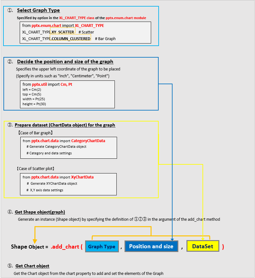
【➀】 When creating a shape (graph) object with the add_chart() method of ➃, it is necessary to declare in advance which type of graph will be created.
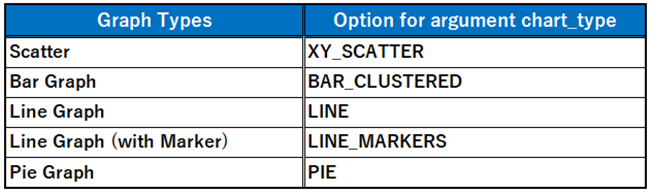
The graph type definitions (Enum) are compiled in the XL_CHART_TYPE class and imported.
python-pptx Official Documents (XL_CHART_TYPE Class)
XL_CHART_TYPE — python-pptx 0.6.18 documentation (python-pptx.readthedocs.io)
The main definitions of the XL_CHART_TYPE class include the following.
It supports various types of Exce graphs, but does not seem to support Three-dimensional (3D) graphs.
【➁】 Decide where the graph will be placed (starting at the upper left corner of the slide) and the size of the graph area (height and width). The units used to determine slide coordinates include Inches (Inches), Centimeters (Cm), and Points (Pt). Import the classes of the required unit.
※If you do not specify a specific unit, the Emu unit is applied, but for us Japanese, it is difficult to handle, so we recommend using the above unit class.
【➂】 Prepare a reference data ChartData object for the graph. Data classes are provided separately for each type of graph to be created. For bar and line charts, import the ChartData class in advance, and for scatter plots, import the XyChartData class. (details, see below)
【➃】When the Shape(GraphicFrame) object is getted with the add_chart() method, it is added to the Shapes collection at the same time. The argument of the add_chart() method is set to the object prepared in ➀➁➂.
【➄】You cannot directly manipulate a graph from the Shape (GraphicFrame) object (container for a graph, table, or SmartArt) obtained with ➃. After getting the Chart object by using the chart property, detailed settings of the Chart are made using the attributes under the Chart object.
<Additional Information>
Also supplements on how to create a dataset (➂).
For datasets, knowledge of graphing in Excel is required.
From now on, the explanation will be based on the assumption that you understand “What is a series? What is a category (series)? In this article, for example, given the bar chart in Fig4, the designations of data categories are unified as follows.
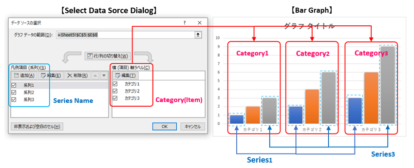
Category (item) refers to the number of areas classified on the X-axis.
The series is a unit for grouping Y-axis values for each category. In the example shown in Fig4, there are three categories (items, red boxes), and each category contains three series (blue boxes).
In addition, Fig4 (”Bar chart”) is a type of graph in which each series shares a common category (item), but graph types such as ”Scatter” and ”Bubble charts” allow you to specify an independent item (X-axis value) for each series.
These are the prerequisite knowledge for graph creation.
Now, each object, method, and attribute that appeared in the flow shown in Fig1 will be explained in detail in the next section.
1.1 Define reference data (ChartData object)
To create a graph, the data to which it refers must be defined in advance. Specifically, define the ChartData object to be passed to the arg:data of the add_chart() method in the process ➃ of the flow shown in Fig1 above.
The procedure for creating ChartData objects and their classes differ depending on the type of graph. Therefore, you need to use them differently. In summary, they are as follows.
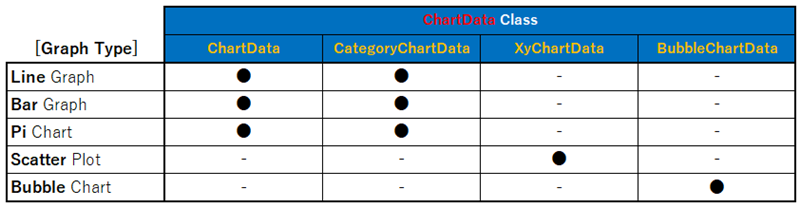
Required classes are broadly classified according to whether the graph shares categories (items) or not, and each is explained in detail in the next section.
1.1.1 Reference data for Line, Bar and Pie Chart <CategoryChartData class>
For Line, Bar, and other types of graphs in which multiple series share common categories, The object of the CategoryChartData class or ChartData class is used as the reference data.
The format is as follows.
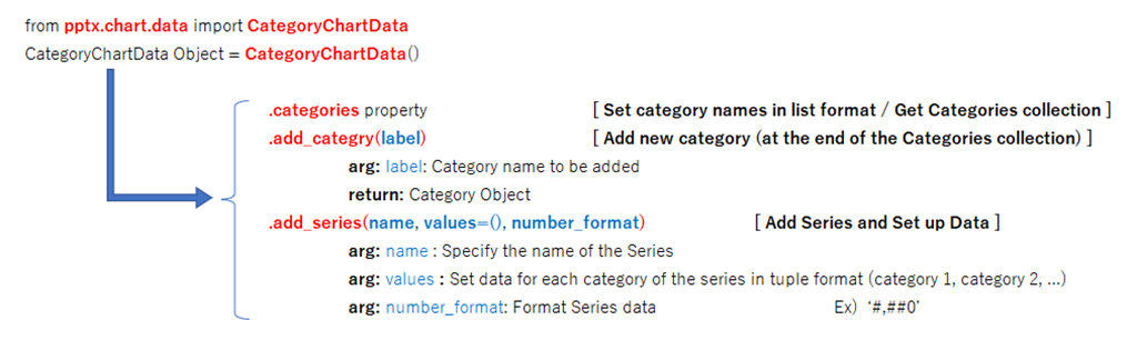
from pptx.chart.data import CategoryChartData
CategoryChartData()
return: CategoryChartData Object
from pptx.chart.data import ChartData
ChartData()
return: ChartData Object
The above two classes are functionally identical. The following is a complete alias, as described in the official documentation. It is commented that “CategoryChartData class” is recommended for new development in the future.
ChartData is simply an alias for CategoryChartData and may be removed in a future release. All new development should use CategoryChartData for creating or replacing the data in chart types other than XY and Bubble.
<Quotes from official documentation> Comments on the ChartData class
Once the object has been acquired, the next step is to set the “Category (item name)” and “Series data” through the properties (attributes) under the object.
<Set and Get Category>
CategoryChartData Object.categories
Func:Set category names in list format / Get Categories collection Ex) [‘item1’, ‘item2’, …]
<Add Category>
CategoryChartData Object.add_categry(label)
Func:Add a new category (at the end of the Categories collection)
arg: label:Category name to be added
return: Category Object
<Add Series and set up Data>
CategoryChartData Object.add_series(name, values=(), number_format)
Func:Adding a series and setting up data
arg: name:Specify the name of the series to be added
arg: values :Set each data of the series in tuple format (cate1, cate2, …)
arg: number_format: Set the format of series data ex.) ‘#,##0’
In other words, use categories property (add_category() method) to set categories (item names) and add_series() method to set series data. Both are methods and attributes under the CategoryChartData object.
It may be difficult to understand with just an explanation of the format, an example of creating reference data is shown in the sample code below.<List1>
from pptx.chart.data import CategoryChartData	    # Class that provides data types for categorical graphs
# Create CategoryChartData object and set category, series name, and each data.

c_data = CategoryChartData()                 	# Generate CategoryChartData object
c_data.categories = ['2019', '2020', '2021']   	# Category name setting
c_data.add_series('X', (1250, 2005, 1660))    	# Specify data for each category (Series 1)
c_data.add_series('Y', (620, 850, 750))     	# Series 2
c_data.add_series('Z', (175, 310, 220))     	# Series 3
<List1> allowed us to generate a dataset (ChartData object) with three categories (2019, 2020, 2021) and three series (X, Y, Z).
1.1.2 Reference data for “Scatter plots” <XyChartData Class>
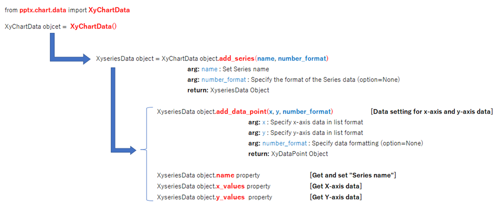
For scatter plots and other types of graphs that allow specifying individual items (X values) for each series, objects of the XyChartData class are used as reference data. The format is as follows.
Now that the object has been obtained, we will “add a series” and “set the data (X,Y data combination) of the series” through the methods under the object.
<Adding a Series>
XyChartData Object.add_series(name, number_format)
arg: name :Set the series name
arg: number_format :Specify the format of the series data (Option=None)
return: XyseriesData Object
<Setting up data for a Series>
XySeriesData Object.add_data_point(x, y, number_format)
arg: x: Specify x-axis data in list format
arg: y: Specify y-axis data in list format
arg: number_format: Specify data format (Option=None)
return: XyDataPoint Object
The series itself is managed by the XySeriesData object obtained by the add_series() method. In addition, individual series data (X,Y data combinations) are set using the add_data_point() method.
The object hierarchy is deeper and more complex than in the previous <Sec1.1.1>
ChartData, because it goes through XySeriesData. The hierarchical structure is shown below. (Fig7)
Now, since I think it is still difficult to understand only by the explanation of the format, let’s check it with the sample code to create the reference data of the scatter plots.<List2>
from pptx.chart.data import XyChartData         		# Data type for XY graph

# Create an XyChartData object and set the series and X,Y dataset

vals1 = []
vals2 = []

for n in range(20):                        # Prepare Data Set
    vals1.append((n+0.5, 0.8*(n+0.5)+1))
    vals2.append((n, 0.25*n*n-0.47*n+2.75))

c_data =XyChartData() 			               # Prepare CategoryChartData object

s1 = c_data.add_series('系列1')    		   # Set series name
s2 = c_data.add_series('系列2')

for val in vals1:
    s1.add_data_point(val[0], val[1])  		 # Set dataset to series1

for val in vals2:
    s2.add_data_point(val[0], val[1])   		# Set dataset to series2
In <List2>, two series (“Series1”, “Series2”) are prepared in lines14 and 15.
The data referenced by the series is set in lines 18 and 21. The data is prepared in advance in lines 9 and 20 as a list of 20 tuples (X, Y).
1.2 Define the ”Frame” of the graph(GraphicFrame Object)
In <Sec1.1>, reference data has been defined. This section describes the frame (GraphicFrame object) used to place the graph on the slide.
The GraphicFrame object is type of Shape object. Therefore, it must be added to the Shapes collection, which contains all the elements that make up the slide. The following add_chart() method is provided for this purpose.
Shapes Collection.add_chart(chart_type, x, y, cx, cy, chart_data)
arg: chart_type :Specify the graph type (Enum of XL_CHART_TYPE class) Details are described later.
arg: x :Specify X-position in the upper left corner of the graph
arg: y :Specify Y-position in the upper left corner of the graph
arg: cx :Graph Width
arg: cy :Graph Height
arg: chart_data: Set reference data (ChartData object)
return:Shape(GraphicFrame) object / Add to Shapes collection
Select the type of graph you wish to add from the XL_CHART_TYPE class (Enumeration) and specify it in the arg:chart_type. (Fig9)
The arg:chart_data is set to the reference data (ChartData object) described in section <1.1>.
1.3 Setting “Title”, “Axis” and “Legend” (Chart Object)
Added a GraphicFrame(Shape) object to the slide, so the graph now reflects the default settings.
However, the design at this point is minimal and simple, so you will want to customize the looks.
The Chart object, which can be obtained from a GraphicFrame(Shape) object using the chart property, provides many attributes necessary for chart customization. This section presents a selection of frequently used graph settings.
GraphicFrame Object.chart property
return: Chart Object
The main methods and properties under the Chart object are as follows.
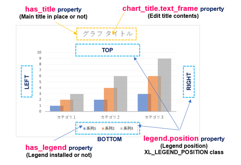
【 Title 】
Sets the “Main Title” of the graph. X-axis and Y-axis titles are described below.
| 【Chart Object】 | 【Functions】 | 【Other/Details】 |
|---|---|---|
| has_title property | The ”Main Title” is set or not | True(Valid)/False(Invalid) |
| chart_title.text_frame property | Set text for title | Set by【TextFrame Object】 (same as normal text setting) |
【 Legend 】
“Legend” is essential to distinguish between series data. Attributes related to the legend are mainly as follows.
| 【Chart Object】 | 【Functions】 | 【Other/Details】 |
|---|---|---|
| has_legend property | Setting with/without legend | True(display)/False(hidden) |
| legend.position property | Specify the location of the legend | Select from【XL_LEGEND_POSITION Class】definitions (Enum) BOTTOM, RIGHT, UP… |
| legend.include_in_layout property | Enable/disable legend placement within the plot area | True/False |
The following Fig10 is an example of the application of properties related to “Title” and “Legend.
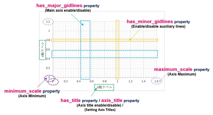
【 X-Axis/Y-Axis 】
Axis settings can be set individually for the X and Y axes. The X-axis is set by the category_axis property and the Y-axis by the value_axis property, which is obtained from the Axis object and set by the attributes under it.
Most of the attributes are common to both the X and Y axes, but some are specific to the Y axis, so please refer to the official documentation. The major attributes are listed below.
| 【Chart Object】 | 【Functions】 | 【Other/Details】 |
|---|---|---|
| category_axis property | Set the X axis format | Set by Axis object |
| value_axis property | Set the Y axis format | Set by Axis object |
| 【Axis Object】 | 【Functions】 | 【Other/Details】 |
|---|---|---|
| has_title property | Enable/disable axis title setting/reading | True(Valid)/False(Invalid) |
| axis_title property | Set the title of the axis | Set by【TextFrame Object】 |
| has_major_gridlines property | Enable/disable spindle line setting/reading | True(Valid)/False(Invalid) |
| minor_gridlines property | Enable/disable auxiliary line setting/reading | True(Valid)/False(Invalid) |
| maximum_scale property | Specify the maximum value of the axis | Specified in float If None, automatic setting |
| minimum_scale property | Specify the minimum value of the axis | Specified in float If None, automatic setting |
The following Fig.11 shows an example of the application of the Axis (X,Y) setting.
The above is a description of the main objects for inserting graphs into slides.
In the next section, we will show two code examples that actually insert graphs.
2. Examples to insert “Graph”

The following are practical examples of the various objects, methods and properties that have been described so far. Here are some examples of general ”Bar graphs” and ”Scatter plots”.
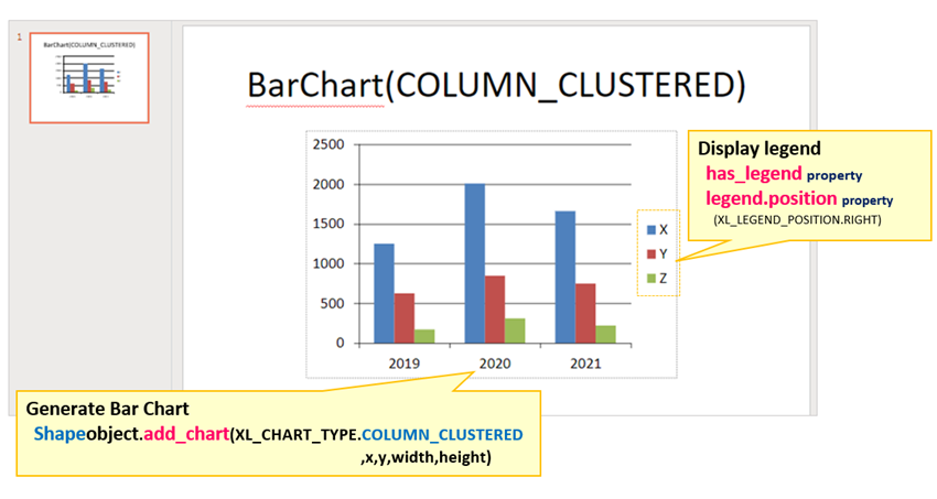
2.1 Sample of “Bar graph”
The is an example of “Bar graph“.
The code summary is that after preparing a categorized reference data set (CategoryChartData object), the add_chart() method inserts the chart into the slide. Also adds a legend and arranges the graph.
from pptx import Presentation
from pptx.chart.data import CategoryChartData	# Classes providing reference data types
from pptx.enum.chart import XL_CHART_TYPE     # Class that defines the type of graph
from pptx.enum.chart import XL_LEGEND_POSITION  # Class that defines the position of the legend
from pptx.util import Cm                    	# Class that defines cm (centimeter) units

#--------------------------------------------------------------------------
# Generate XyChartData object and define dataset

c_data = CategoryChartData()                    	# Create CategoryChartData object
c_data.categories = ['2019', '2020', '2021']    	# Category name setting
c_data.add_series('X', (1250, 2005, 1660))      	# Data setting for each category (Series1)
c_data.add_series('Y', (620, 850, 750))         	# Series2
c_data.add_series('Z', (175, 310, 220))         	# Series3

#--------------------------------------------------------------------------
prs = Presentation()
sld0 = prs.slides.add_slide(prs.slide_layouts[5])
sld0.shapes[0].text = "BarChart(COLUMN_CLUSTERED)"

# Add graphs (Bar graphs)
sld0.shapes.add_chart(XL_CHART_TYPE.COLUMN_CLUSTERED	# Add chart object to the shapes collection
                           , Cm(5), Cm(6)            	# Set graph type, position, and data as arguments
                           , Cm(15), Cm(10), c_data)
ch = sld0.shapes[1].chart                            	# Obtaining chart object

#--------------------------------------------------------------------------
# Legend Setting

ch.has_legend = True                                	# Enable Legend
ch.legend.position = XL_LEGEND_POSITION.RIGHT        	# Specify the location of the legend (top, bottom, left, right)
ch.legend.include_in_layout = False                 	# Location of legend (inside or outside of graph)

prs.save('Art3_List3_result.pptx')
Now, let me explain the key points of the code.
To define the reference data area of the “Bar chart”, the object is created from the CategoryChartData class and referenced by the variable c_data.
Categories (item names) and series (names and data) are set by the categories property and the add_series() method, respectively. Each data is passed as the list or tuple.
Now we have generated a dataset (ChartData object) with three categories (2019, 2020, 2021) and three series (X, Y, Z).
Add the GraphicFrame object to a slide using the add_chart() method.
The first argument is set to a constant (COLUMN_CLUSTERED) that means a bar chart. Also, set the 6th argument to the reference data set just described. The 2nd, 3rd arguments specify the insertion position (upper left of the graph), and the 4th and 5th arguments specify the size of the graph (width and height).
The chart property is used to get the Chart object from the GraphicFrame object.
The graph is decorated via attributes under the Chart object. In this case, the display of the legend is enabled.
The result of running <List3> is as follows.
A “Bar” graph has been inserted and a legend displayed.
<List3>Execution results are available here.
2.2 Sample of “Scatter Plots”
The is an example of a “Scatter plots“.
The main difference between this bar chart and the previous one is in the way the reference data set is created. Since this is a type of graph that allows specifying categories (item data) for each series individually, reference data sets are generated from the XyChartData class.
In this issue, we will also examine the setting of axes and markers.
from pptx import Presentation
from pptx.chart.data import XyChartData         	# Class that provides data types for XY graphs
from pptx.enum.chart import XL_CHART_TYPE       	# Class that defines the type of graph
from pptx.enum.chart import XL_MARKER_STYLE     	# Class that defines the type of markers
from pptx.util import Cm

#--------------------------------------------------------------------------
# Generate XyChartData object and define dataset

vals1 = []
vals2 = []

for n in range(20):                                  # Creating Data Sets
    vals1.append((n+0.7, 0.6*(n+0.7)+1.5))
    vals2.append((n, 0.35*n*n-0.27*n+3.75))

c_data =XyChartData()                                # Generate CategoryChartData object

s1 = c_data.add_series('Series 1')                   # Series name setting
s2 = c_data.add_series('Series 2')

for val in vals1:
    s1.add_data_point(val[0], val[1])                # Set dataset to series1

for val in vals2:
    s2.add_data_point(val[0], val[1])               # Set dataset to series2
#--------------------------------------------------------------------------

prs = Presentation()
sld0 = prs.slides.add_slide(prs.slide_layouts[6])

# Add graphs (scatter plots)
# Add chart object to the shapes collection

# Specify graph type, position, and reference data as arguments

ch = sld0.shapes.add_chart(XL_CHART_TYPE.XY_SCATTER,
                          Cm(5), Cm(6), Cm(18), Cm(13), c_data).chart

#--------------------------------------------------------------------------
# [Axis Settings

axis = ch.value_axis         			        # Getting value_axis object
axis.has_title = True       			        # Enable axis titles
axis.axis_title.text_frame.text = "Y" 		# Set axis title name

#--------------------------------------------------------------------------
# [Marker Settings]

sers = ch.series                                      # Getting a series

sers[0].marker.style = XL_MARKER_STYLE.CIRCLE   	  # Set marker style for series1(〇)
sers[0].marker.size = 8                           	# Set marker size for series1

sers[1].marker.style = XL_MARKER_STYLE.TRIANGLE   	# Set marker style for series1(△)
sers[1].marker.size = 8                           	# Set marker size for series2

prs.save('Art3_List4_result.pptx.pptx')
Now, let me explain the key points of the code.
First, we will set the series data for the object obtained from the XyChartData class in line 17. The series itself can be added using the add_series() method. In this example, two series are added. (Lines 19 and 20)
Next, the data (X,Y data combination) is set for the added series using the add_data_point() method. This time, we will add the 20 points of data prepared at the beginning of , one point at a time, using the For statement.
Add a graph (GraphicFrame object) to the slide using the add_chart() method.
The first argument is set to a constant (XY_SCATTER) that means a Scatter plots. Also, set the 6th argument to the reference data set just described. The 2nd, 3rd arguments specify the insertion position (upper left of the graph), and the 4th and 5th arguments specify the size of the graph (width and height).
This time, the chart property is further connected to obtain the Chart object at a time.
For Chart objects, enable the title of the Y axis (value axis) with the value_axis property.
In addition, the marker property specifies the marker’s settings (shape and size) for the Series object.
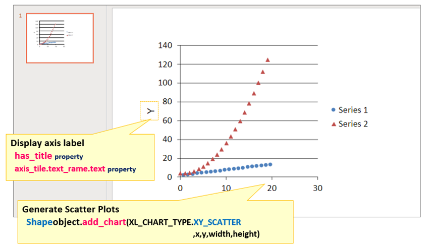
The result of running <List4> is as follows.
Scatter plots (2series, 20points) have been added, with Y-axis titles and plot markers(●,▲).
<List4>Execution results are available here.
3. SUMMARY

How was it?
In this article, we have explained the procedure for creating graphs using the “python-pptx library”.
One of the tips for creating easy-to-understand documents is to objectively show the following points from inorganic numerical data with graphs.
- What can be said?
- What are the expected values and forecasts for the future?
By using the techniques in this article, you can create charts for PowerPoint using only Python.
Finally, let’s summarize the contents of the article so far.
➀. Python-pptx manages graphs as Shape objects. Shape objects can be added to slides with the add_chart() method.
➁. Reference data of a graph is defined by ChartData object, but necessary classes are used according to the type of graph (difference in the sharing method of X-axis for each series). (e.g. CategoryChartData class and XyChartData class)
➂. To customize the components and design of a chart, obtain the Chart object and then use the attributes under it.
In the next article, we will explain how to insert a table into the slide.
Tables are also an important element in organizing data and creating easy-to-understand Presentation.
We will continue to provide illustrated explanations of key points in the next issue. The link will be here.↓

Thank you for reading to the end.